Case study · via Perficient
The Paper Store
A full refresh of a gift retailer’s website, on a tight timeline: more modern, easier to shop, and closer to where the brand was heading.
01 The brief
The Paper Store, a retail gift store, wanted a full refresh of its website: a more modern, user-friendly experience that matched where the brand was going.
The timeline was tight, and the design team was two people: Senior Designer Jena LaPlante and me. Between the two of us we covered research, visual direction, page design, components and documentation.
02 Research and direction
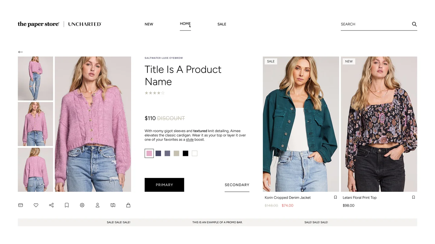
We started with a competitive analysis of other retailers, then set the visual direction with three style tiles for the client to choose from. I designed two of them, Crisp White and Clean Light; Jena designed Color Splash. Each one carries The Paper Store next to Uncharted, its secondary brand, which shares the site.
The client chose Crisp White, shown at the top: mostly white and black, with thin type and simple buttons, so the product photography does the talking.
03 From UX to UI
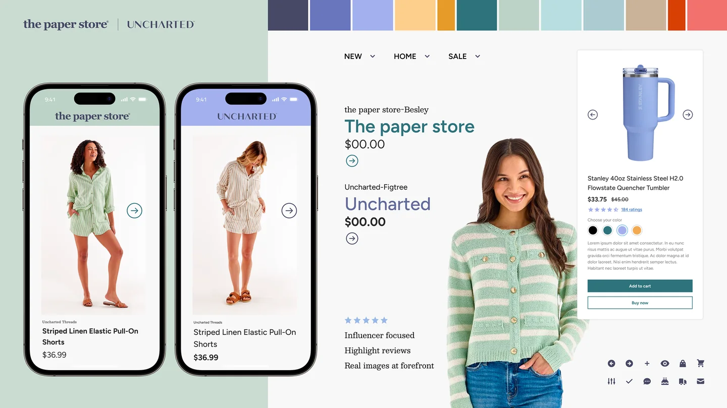
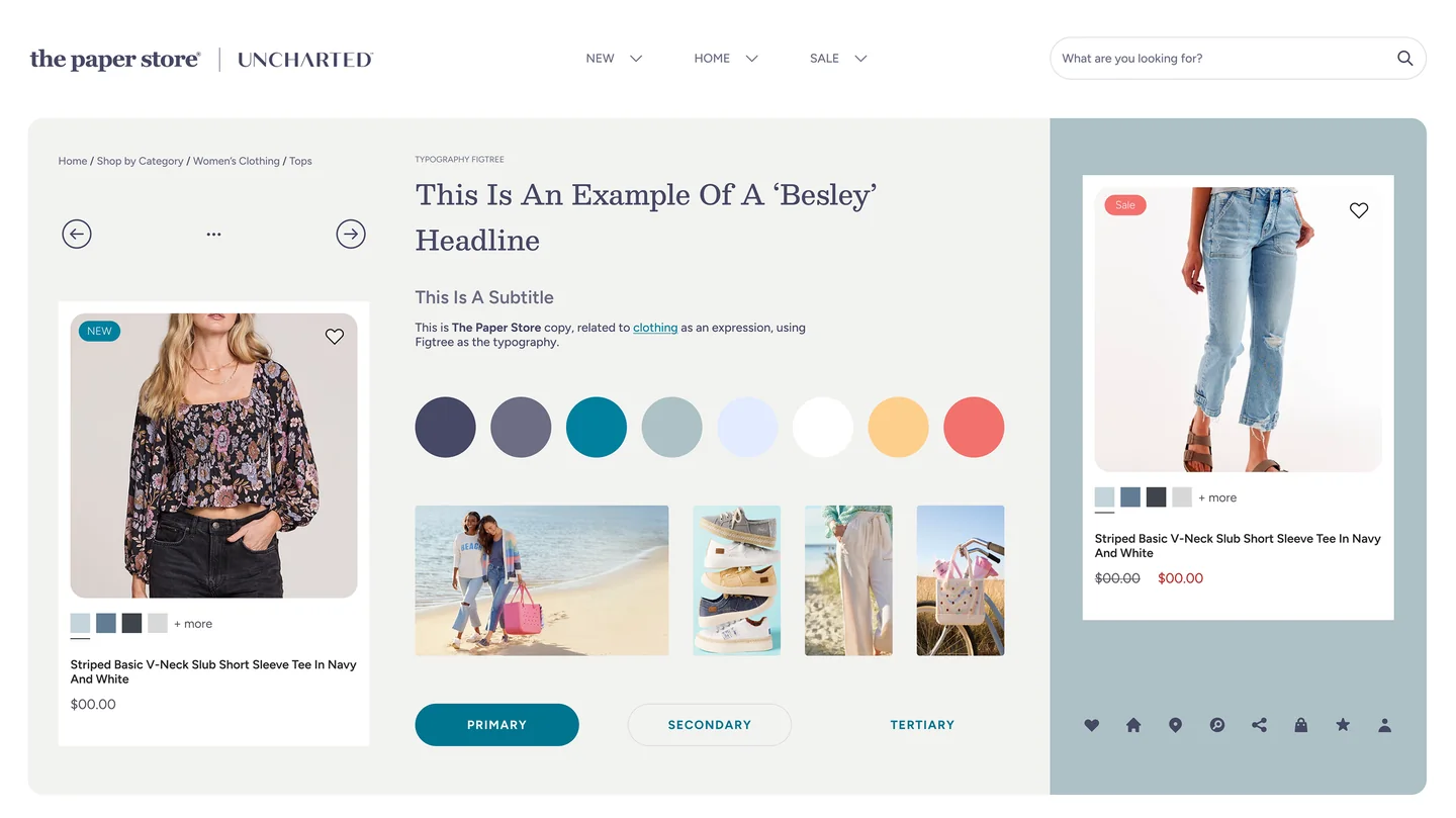
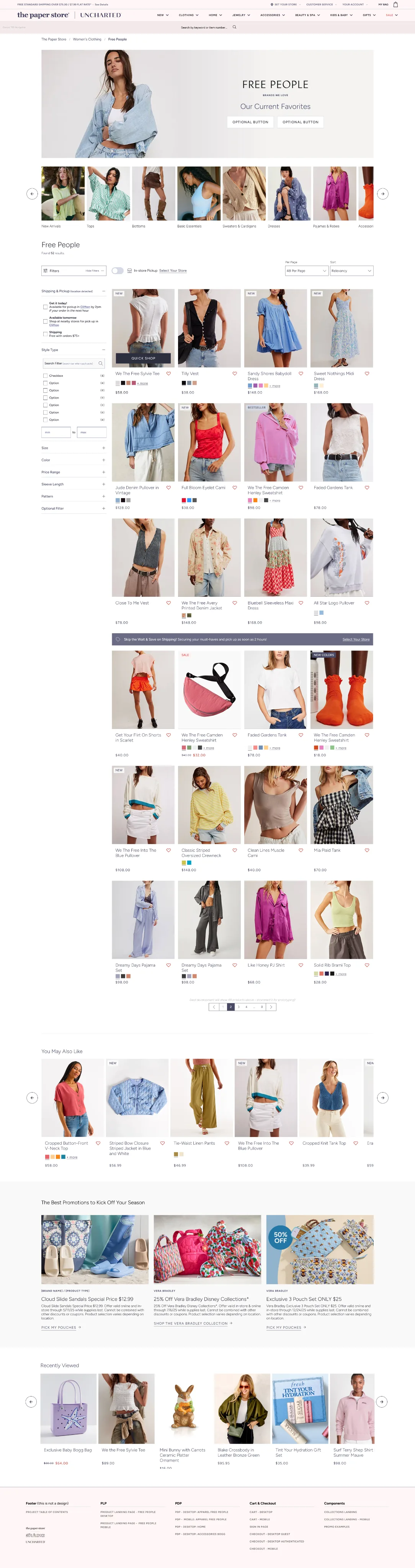
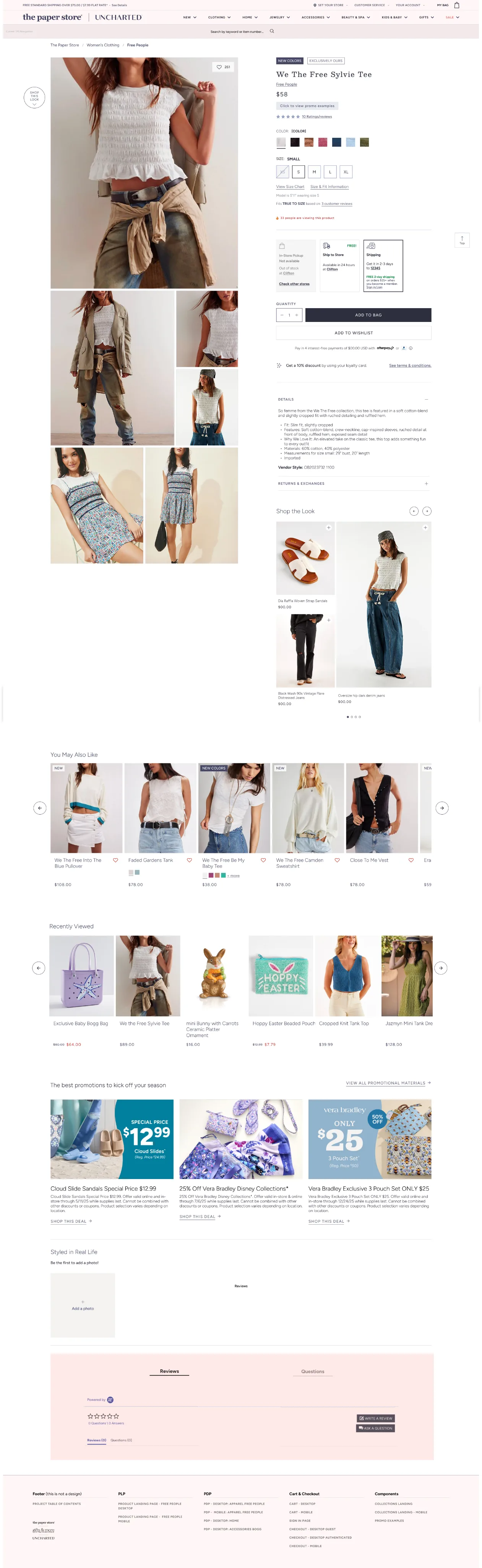
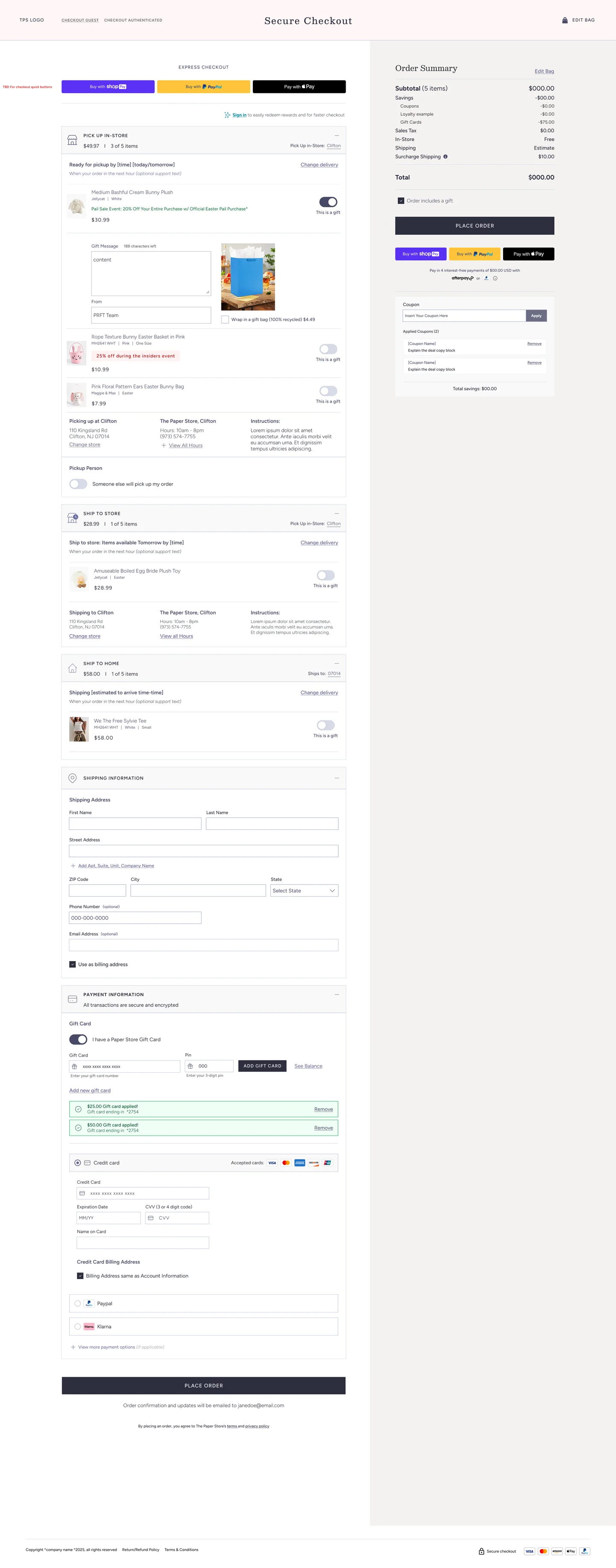
Jena led the UX: structure, flows and priorities for each page. I translated that UX into the UI of most of the pages, including the key templates of any store: the homepage, the product listing page (PLP), the product detail page (PDP) and the checkout.
The aim on every page was the same balance: clean and easy to scan, with room for the product photography to do the selling.
04 A component library in Figma
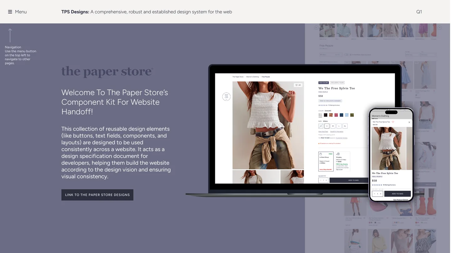
To keep the site consistent and ready for future updates, we built a comprehensive component library in Figma. I built many of its components; Jena wrote the documentation, so the kit could work as a specification for the developers.
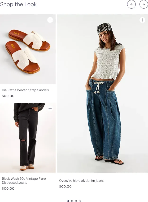
“Shop the Look” is one of them: a full outfit next to its pieces, each one a step away from the bag.
05 Live today
The result was a clean, intuitive e-commerce experience that balances usability with visual appeal, ready for handoff to development. The designs are still in use on the live site today, most visibly on the product listing, product detail and checkout pages.
06 What I took away
I learned a lot from Jena on this one, above all how to work fast without letting quality slip: a tight timeline is easier when the UX is clear and every component is built to be reused.
Designed at Perficient for The Paper Store with Jena LaPlante (Senior Designer). Some screens use placeholder text and sample products. The Paper Store and the brands shown are trademarks of their owners.