Case study
MundoFit
A sports-supplement store in Colombia, redesigned from scratch on Shopify and then made better every month.
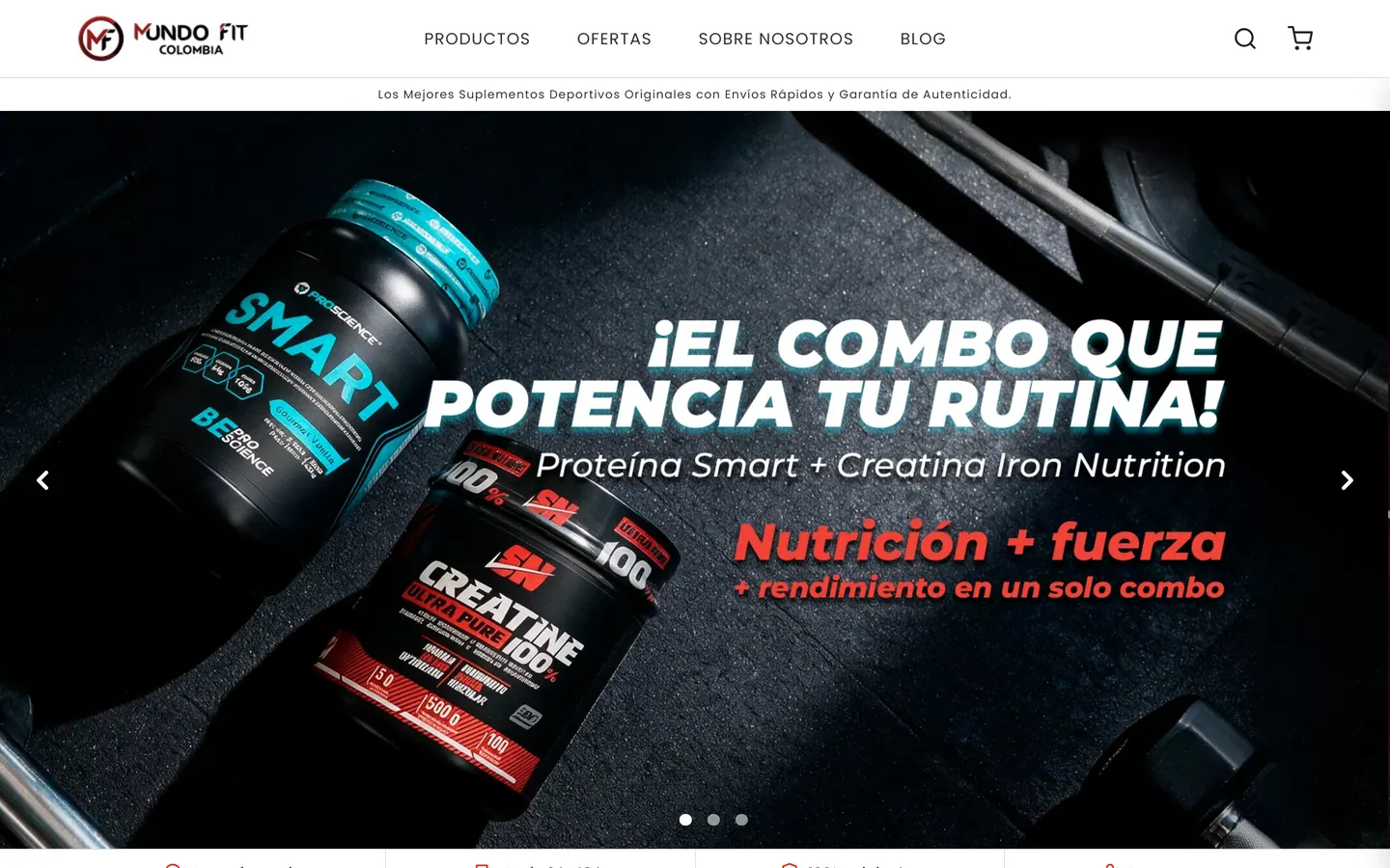
01 The brief
MundoFit Colombia sells sports supplements online across the country: international brands next to GO, its own line. In August 2025 we started redesigning the store from scratch, and after launch the same team stayed on to keep designing, building and running it.
My role grew with the project. I was the product owner, the contact for the client and the sales side, a UI/UX designer and the one writing things down. From month six on I also took over development, using AI to build the store’s plugins, components and templates.
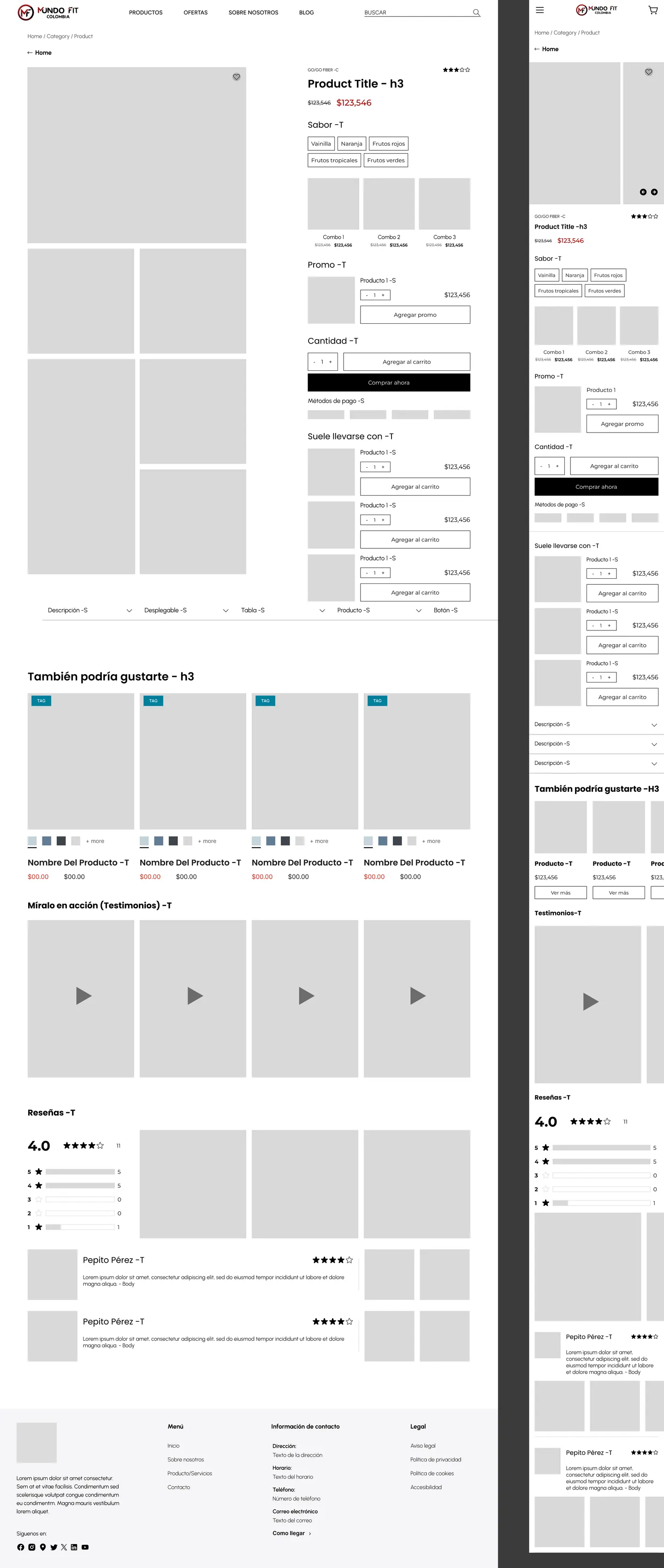
02 A new store, from wireframes
We went step by step: wireframes first, then high-fidelity design, then development. Ana María Mosquera led UX and CRO, Michelle Fernández and I designed the interface, and Carlos Ramírez handled the first round of development and helped me maintain the site for a while.
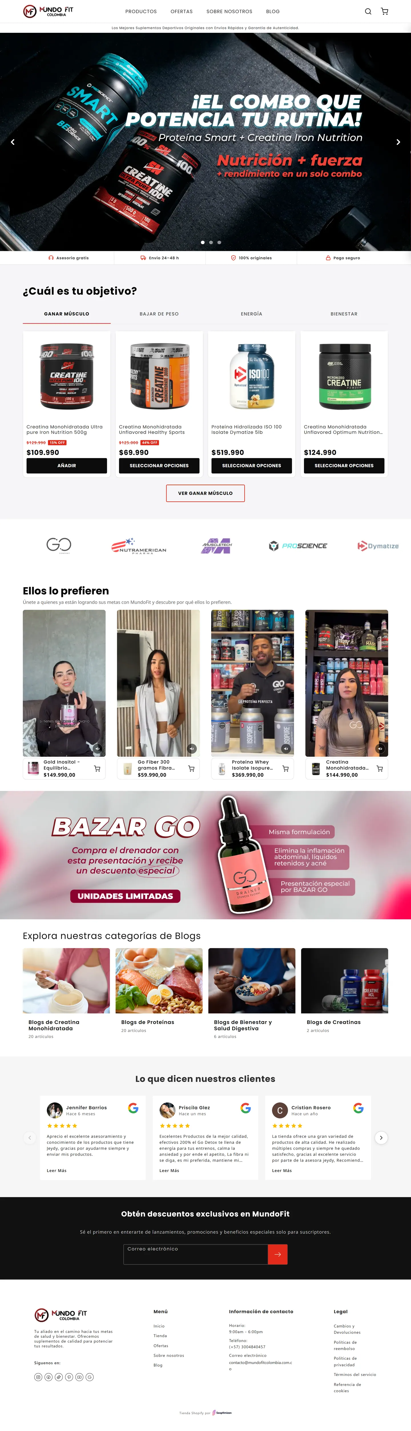
The new homepage leads with what a supplement buyer needs to trust a store: original products, fast shipping, expert advice and secure payment, then a fast way into the catalog.

03 Shop by goal, or by brand
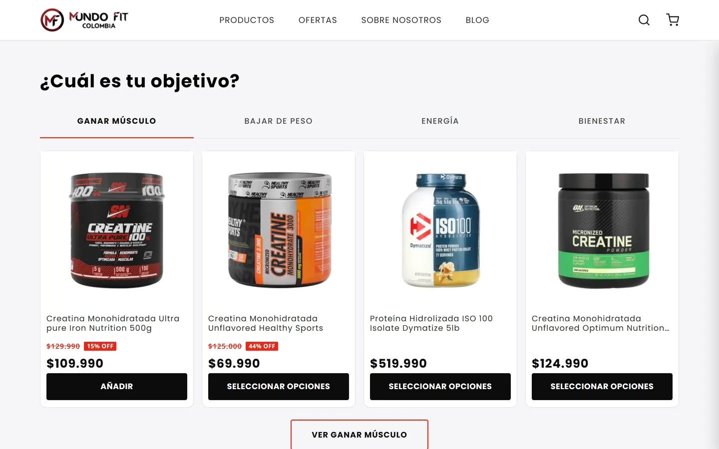
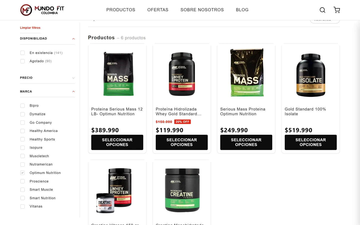
The catalog, about 280 products, is organised around four goals: build muscle, lose weight, energy and performance, and wellness and beauty. The homepage opens on the same four goals, as tabs.
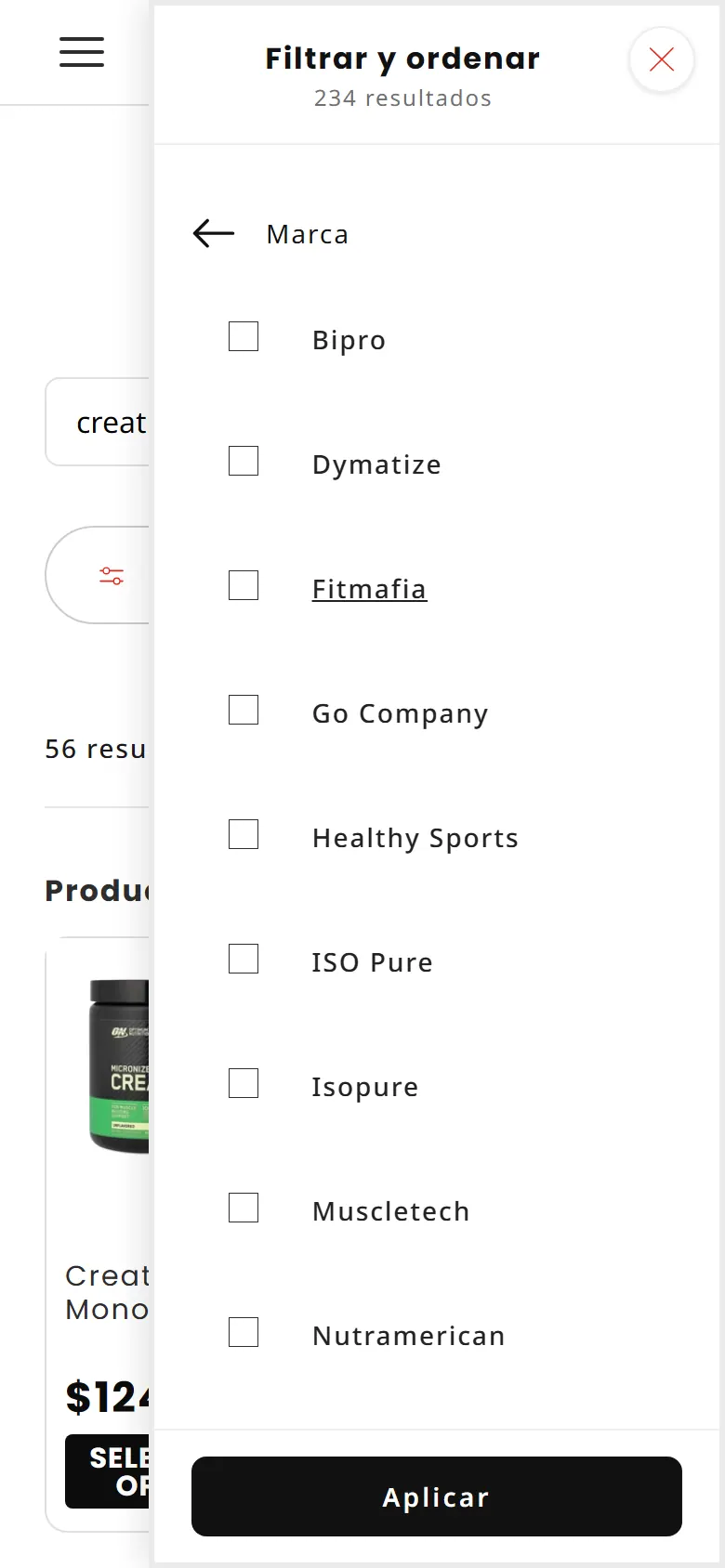
The other way people shop is by brand, and Shopify’s standard filter couldn’t do it. I proposed a brand filter of our own: every product got a brand field, filled in for 247 products by a script we tried on a small batch first. The filter sits in the sidebar on desktop and in the filter menu on mobile.
04 From audit to quick-add
With the store live, Ana María Mosquera audited it against Baymard and CXL guidelines and a direct competitor. The homepage was trying to say too much: more than fourteen sections, repeated carousels and generic buttons. The top of the page had no trust messages, and the blog brought visitors who never saw a product.
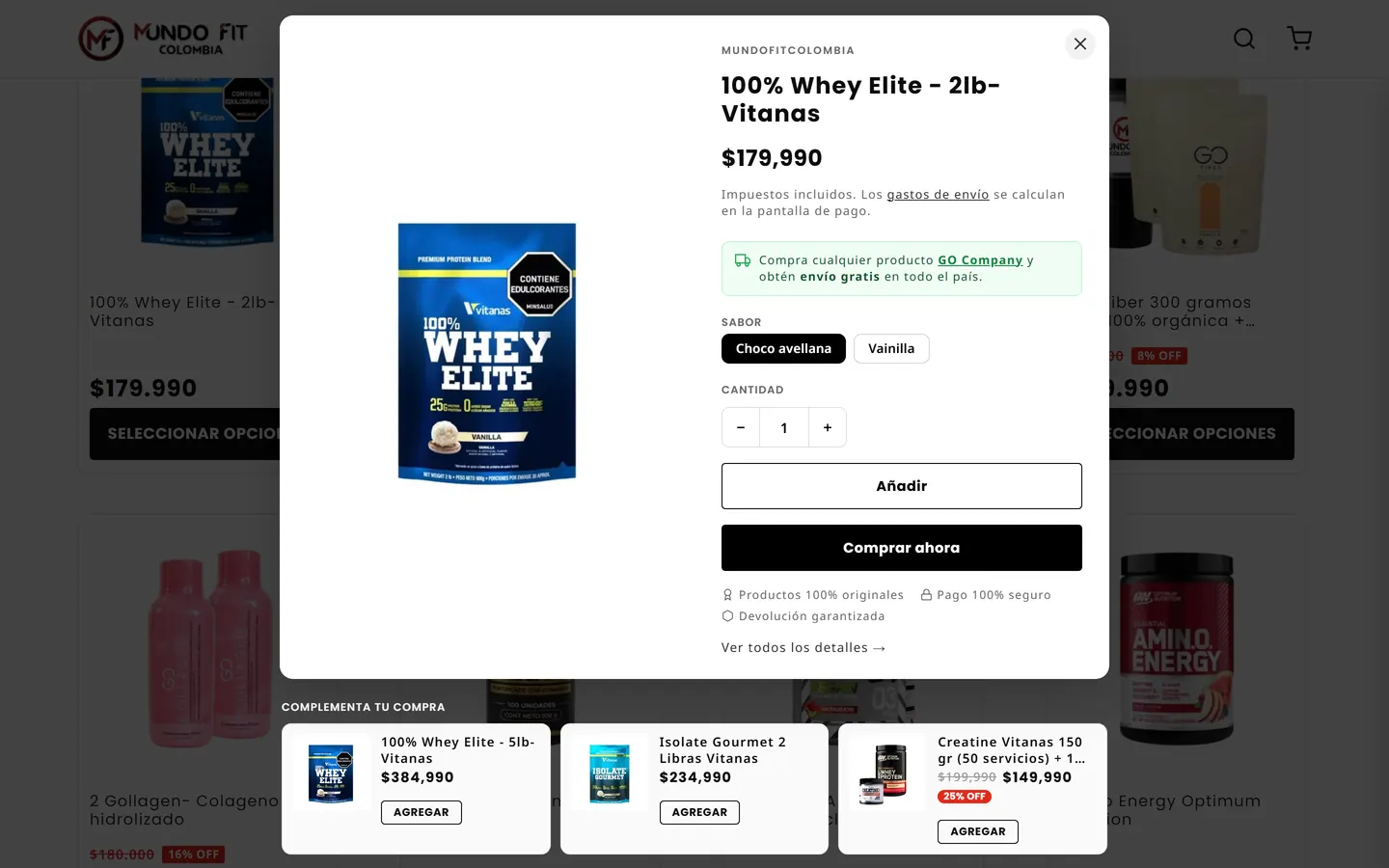
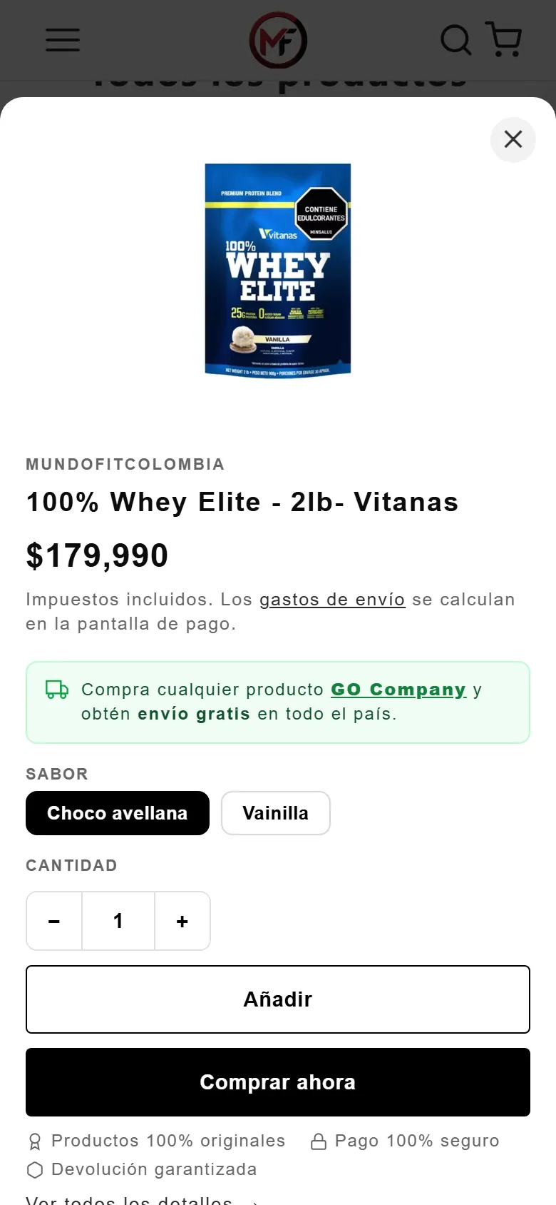
We put most of the findings into practice: a trust bar, buttons that say what they do, products inside every blog article. The most visible one is quick-add: from any product card you pick flavour and quantity and buy, without opening the product page or losing your place.
05 Making it fast
Once I took over development, speed was the biggest job. The page jumped while it loaded, because images had no fixed proportions and styles arrived in the wrong order; some scripts were loading once for every product card on the page. I fixed it in rounds and measured each one.
- PageSpeed score, mobile
- 29 → 76+
- Layout shift (CLS), mobile
- 0.57 → 0.001
- Core Web Vitals, mobile
- Passed
06 Back in stock, at no cost
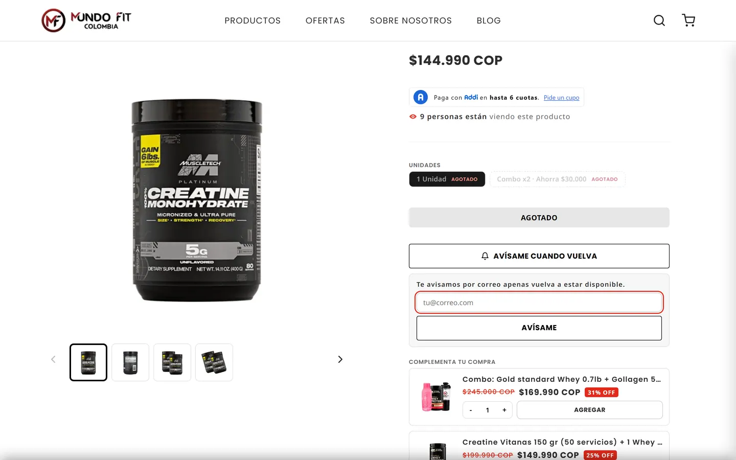
When a product sells out, shoppers can leave their email and get a message the moment it’s back. Instead of another paid app, I built a small backend on Cloudflare and Resend: no monthly cost for the client, and room to grow.
The same system reports to the team twice a week: how many people are waiting, and for which products. That way, restocking can follow demand.
07 Results
In the first half of 2026 the store grew against the same months of 2025, mostly through more orders and bigger baskets. It’s a team result: SEO by SEOptimizan made Google search the store’s top sales channel, on top of the site the rest of us built.
- Sales
- +72%
- Orders
- +33%
- Average order value
- +28%
Whole store, Shopify Analytics: 1 Jan–18 Jun 2026 vs 1 Jan–30 Jun 2025.
Also shipped along the way: a product rail on every blog article, a video section with products linked in the video, a help center, and the handover of Analytics, Search Console, Merchant Center and the Business Profile from the previous provider.
08 What I took away
This was a demanding project, and my first time as the face to the client: negotiating, leading a team and documenting every task. I learned a lot from it, personally and professionally, and I’m still learning.
Designed and built for MundoFit Colombia with Ana María Mosquera (UX/CRO Designer), Michelle Fernández (UI/UX Designer) and Carlos Ramírez (Developer). SEO by SEOptimizan. Screens captured from the live store in October 2026. MundoFit and the brands shown are trademarks of their owners.