Case study · via Perficient
Ford
Three workstreams on Ford’s websites. Two were about applying a new brand right the first time, with no rounds of feedback; the third was about fixing how people find a job.
01 A migration that became a refresh
It started as a technical migration of several external-facing sites. While the backend moved, each site also had to leave behind outdated design and line up with the brand’s evolving identity.
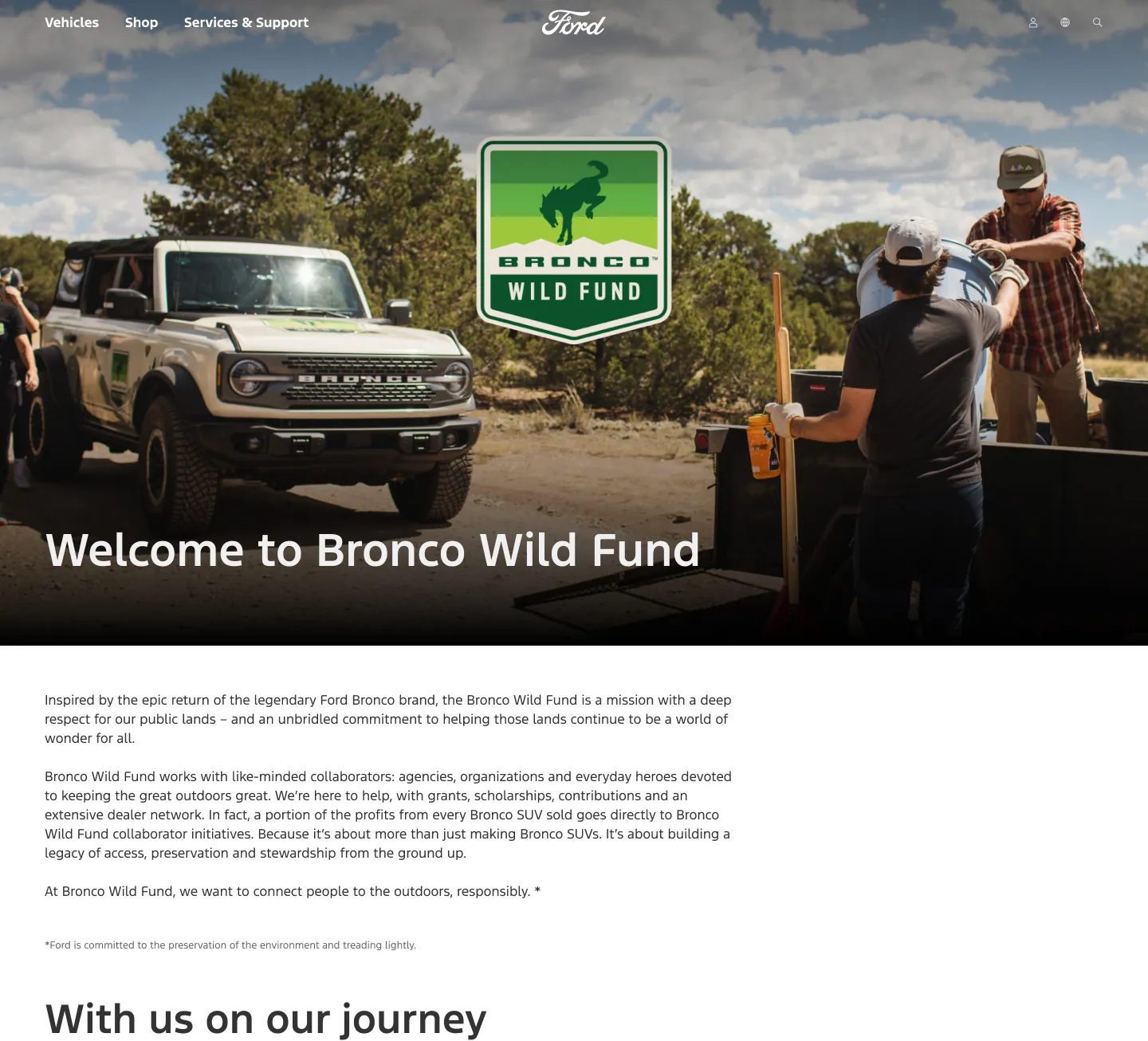
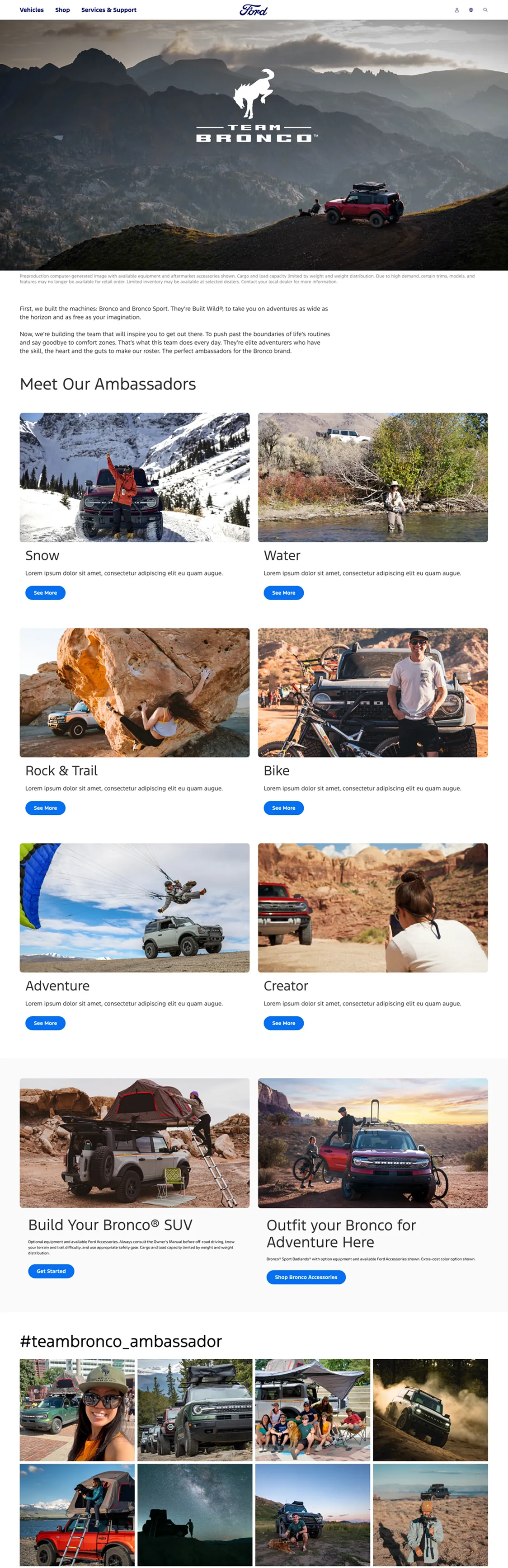
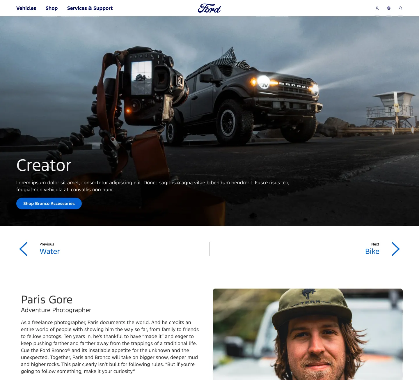
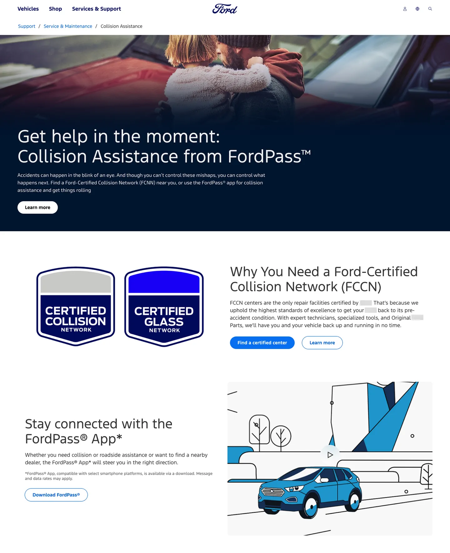
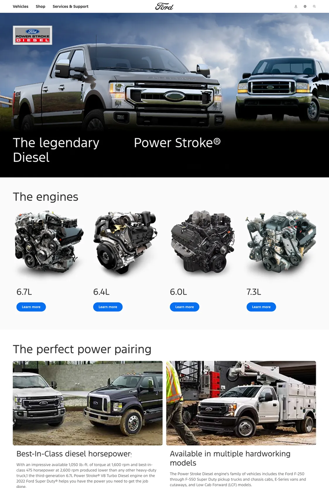
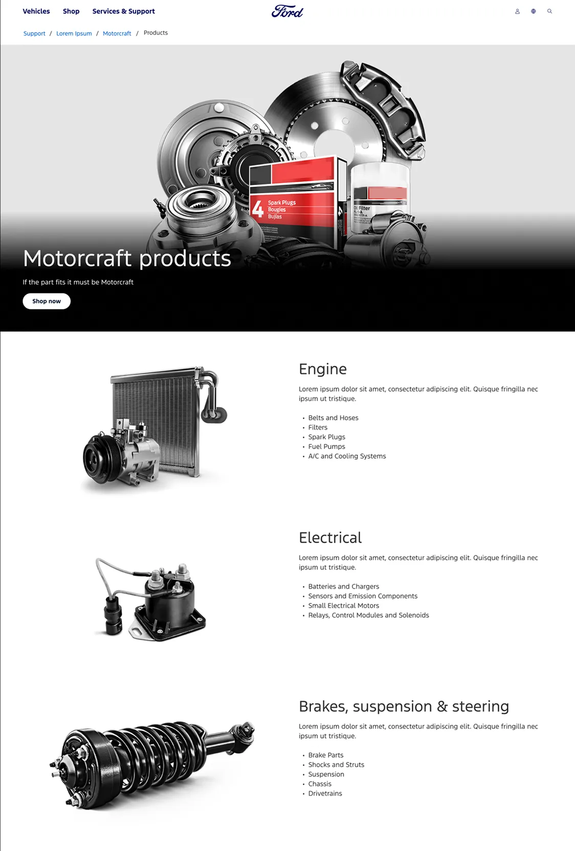
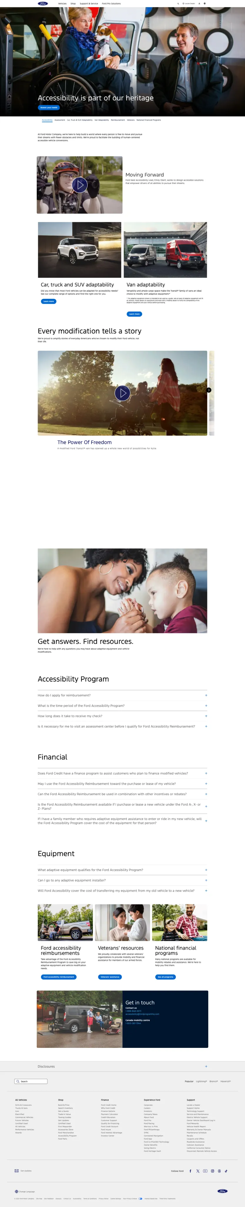
Working with Tyson Damman, then the director on the project, I led the design of the refreshed pages: adapting the updated brand guidelines into flexible layouts and components that worked across very different domains, from Bronco ambassadors to collision repair, diesel engines, parts and accessibility programs. Every layout was built mobile-first.
Strategists ran a content audit for each site before design. I wasn’t part of the audits, but I worked closely with them to understand what each page needed to say. I also picked most of the imagery, except what the content and legal teams provided. Bronco Wild Fund and the other Bronco sites still run on these designs; the ambassadors section went live and was later retired.
02 Built on the design system
With no time to iterate, the design system carried the brand. I worked from Ford’s components, adapted the existing ones to the new look, and proposed custom components where a page needed something the system didn’t have yet, in close contact with developers so everything could be built as designed.
03 The corporate site
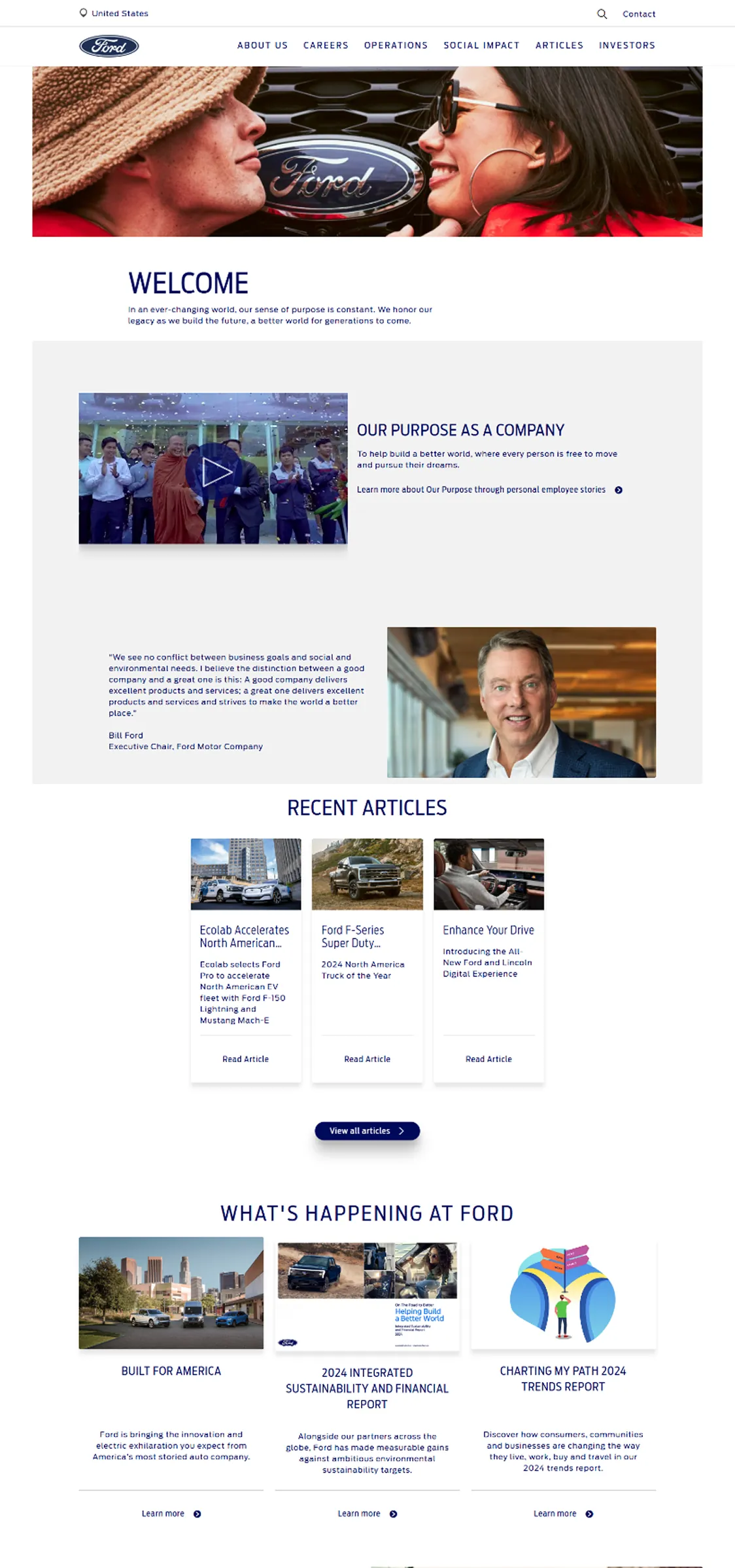
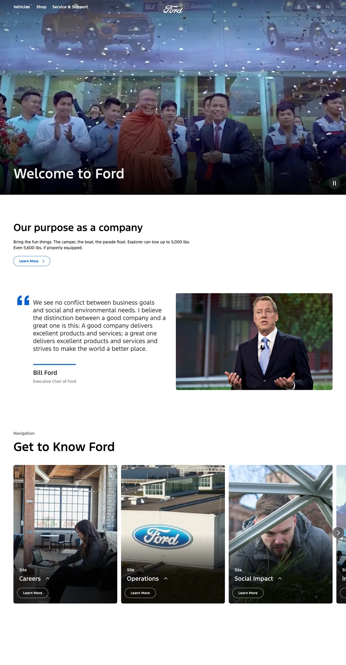
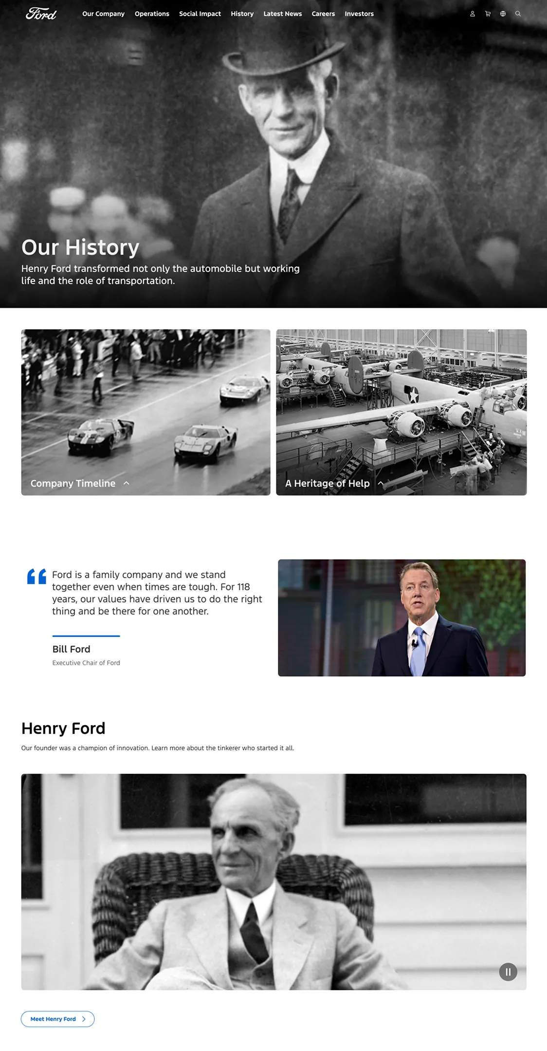
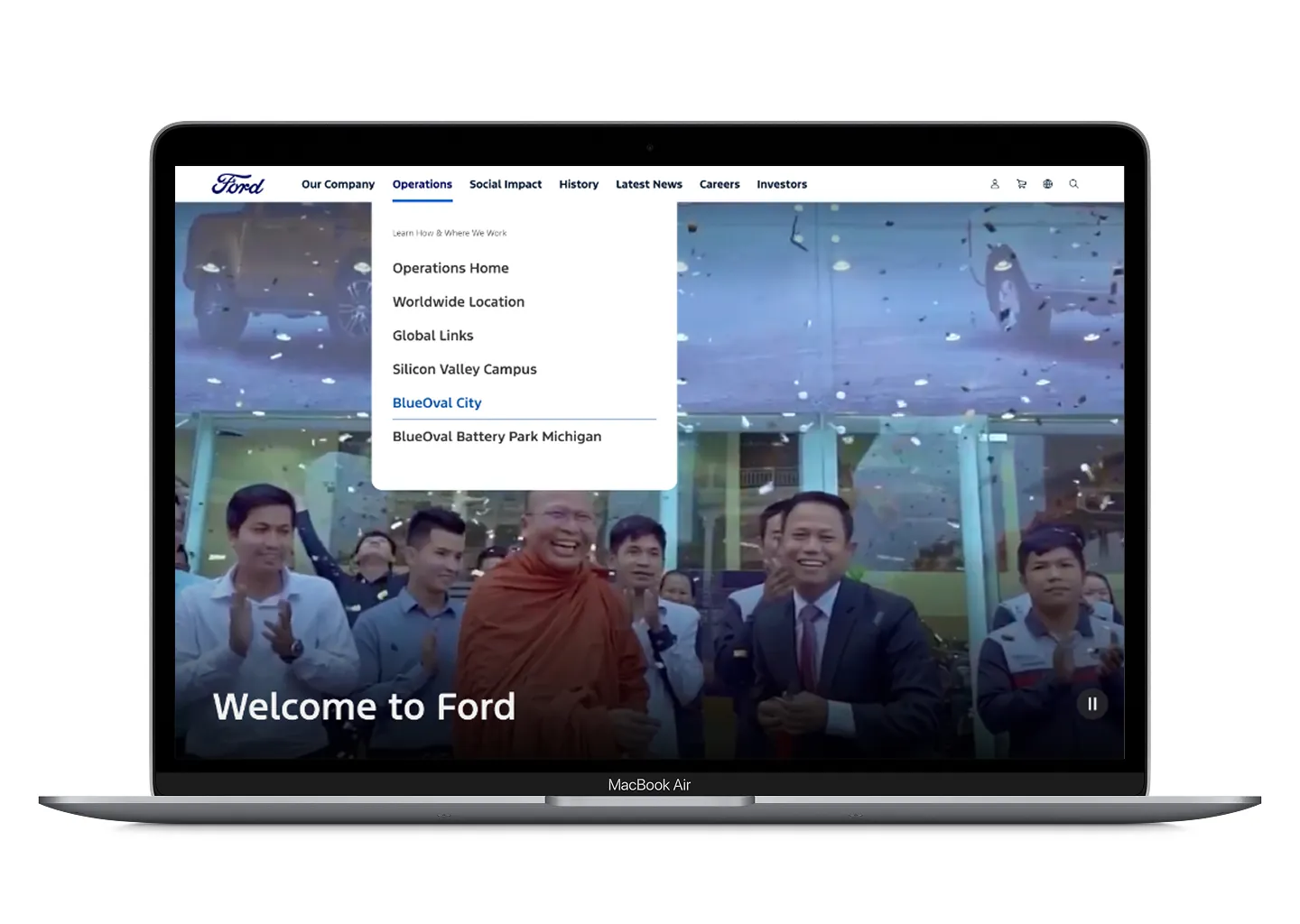
The corporate site was part of the same migration. It shared the goals but not the tone: its content and audience called for a more formal, structured approach.
I translated the new identity into a responsive, accessible design: page layouts, modular components and the responsive strategy, in close alignment with development. Big photography and full-width heroes replaced the boxed, centered layout, and navigation cards now lead to the rest of Ford’s sites.
04 The careers site
This one was mostly UX. I joined halfway through to cover a teammate on leave, working with content strategists, developers and the talent acquisition team.
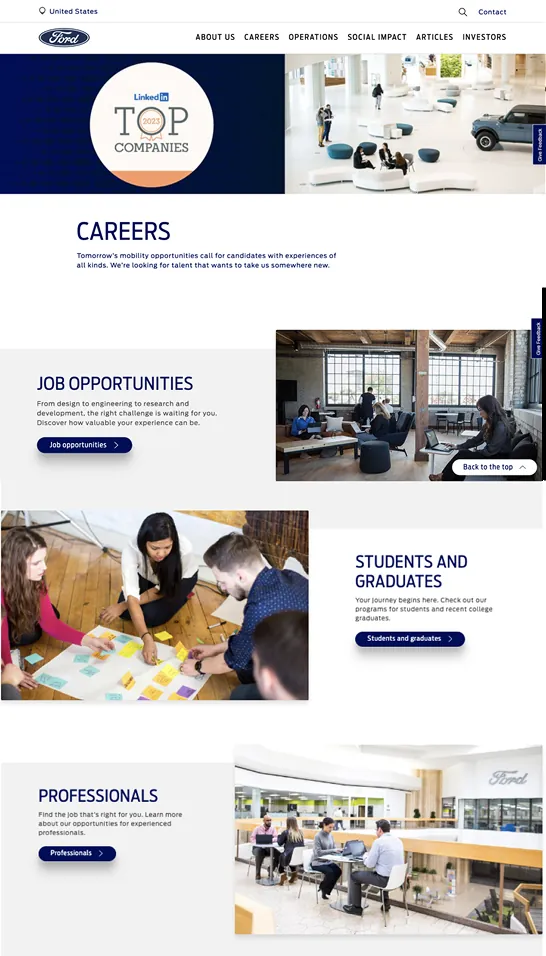
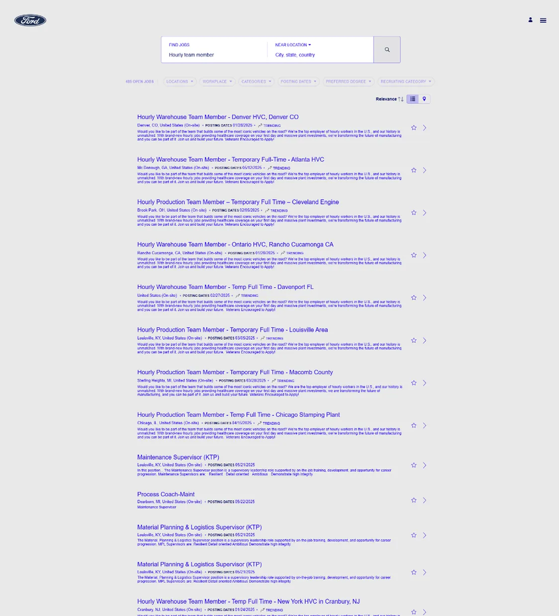
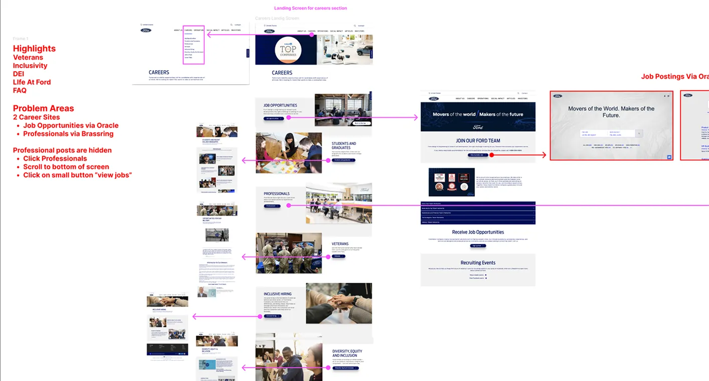
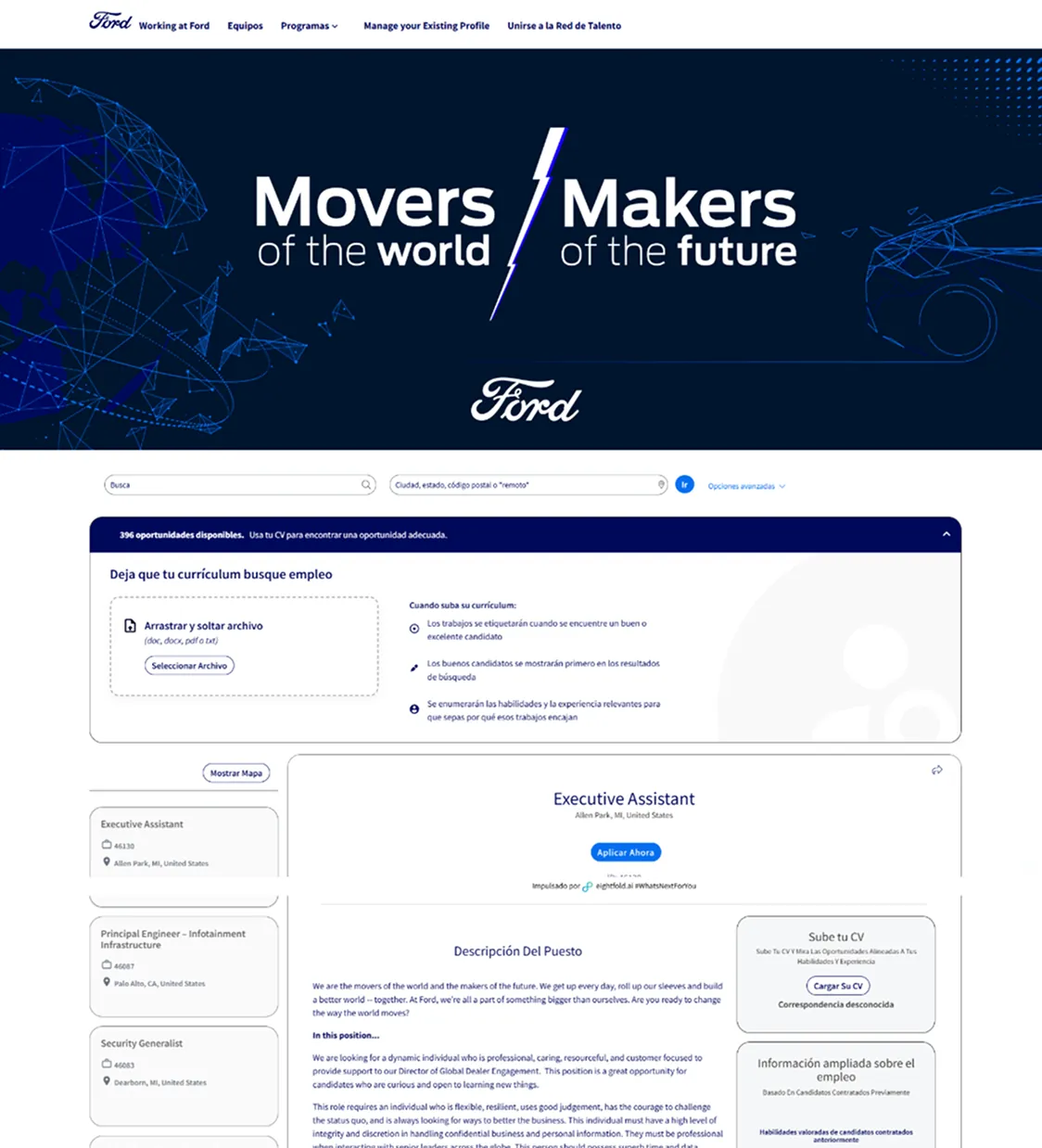
Mapping the existing site showed the real problem: jobs lived on two different career platforms, and professional roles were hidden. To find them you had to click “Professionals”, scroll to the bottom of the page, and find a small “view jobs” button.
05 Search first
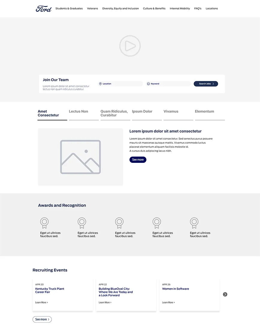
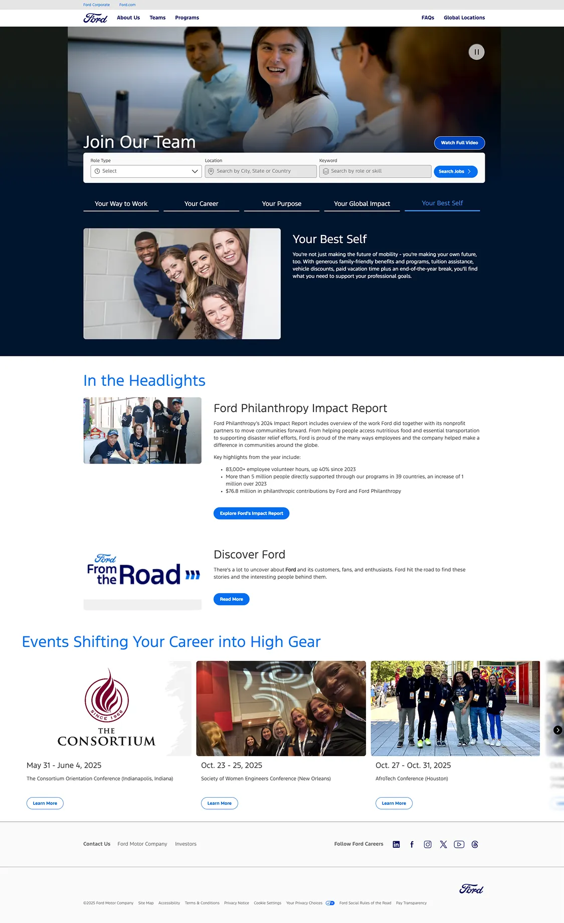
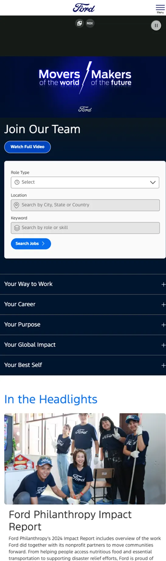
The new landing puts job search at the top: role type, location and keyword, right under the hero, for every kind of candidate. Culture, purpose and events follow, in sections that can grow with future campaigns.
I created the low-fidelity wireframes for job listings, filters, team pages and the application flow, and designed the homepage on the brand’s design system. If I did it again, I’d push for user testing earlier to validate the job discovery interactions.
06 What I took away
With no rounds of feedback, every decision had to be strategic, scalable and grounded in the brand guidelines from the start. Not every process is ideal, but strong foundations and a good design system still get you to great results. And on careers, I learned to jump into a workflow already in motion and make an impact quickly.
Designed at Perficient for Ford with Tyson Damman (Director). Screens come from my design files, some with placeholder text, and from archived captures of the sites. Ford, Bronco, FordPass, Power Stroke and Motorcraft are trademarks of their owner.