Case study · via Perficient
Constructora Bolívar
A platform that turns getting the keys to a new home into a guided experience: the appointment, the keys, the first walk-through and the warranty, in one place.
01 A busy, emotional day
Receiving a new home is exciting and stressful at the same time: an appointment to keep, keys to find, a property to check, and questions that show up only after moving in.
Constructora Bolívar wanted a digital companion for that moment. It had to feel clear and trustworthy, and work for buyers of every age, mostly from a phone, on site.
02 Research as a team
UX Designer Kevin Rubio led the research and the structure. I took part in the user interviews, the card sorting that organized the sections, and the remote usability tests, which gave me first-hand reasons for the visual decisions.
We mapped the homeowner’s journey in three phases (before the delivery, the handover itself, and after moving in) and designed around the questions people ask in each one.
03 Four steps to the keys
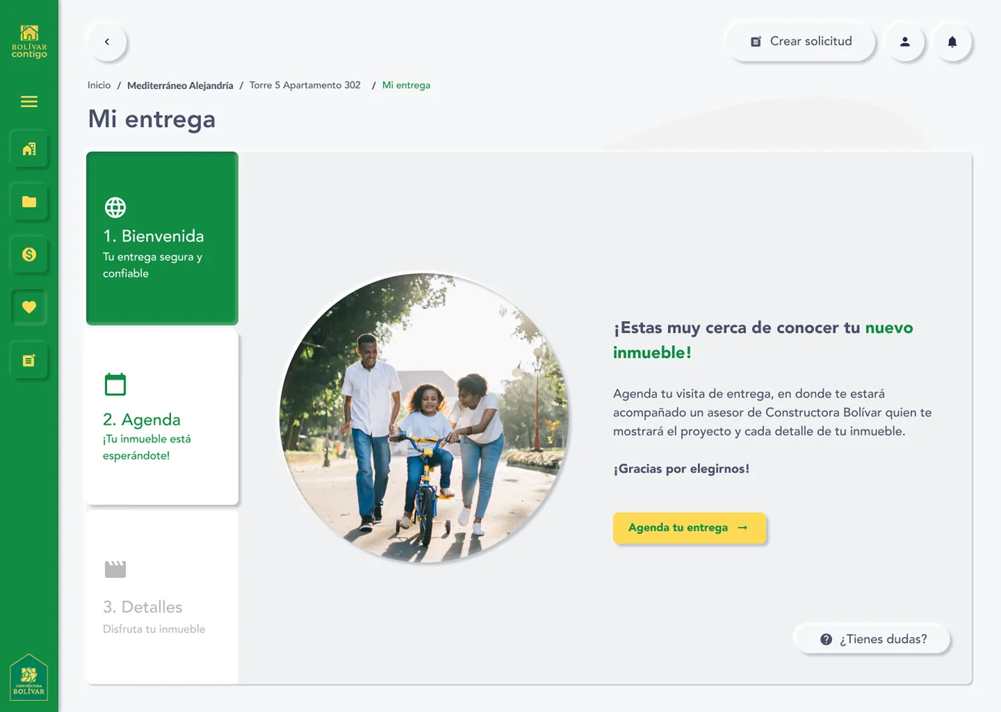
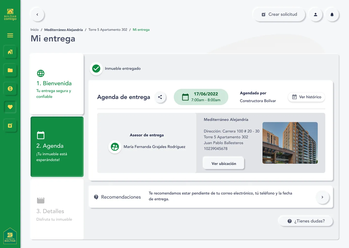
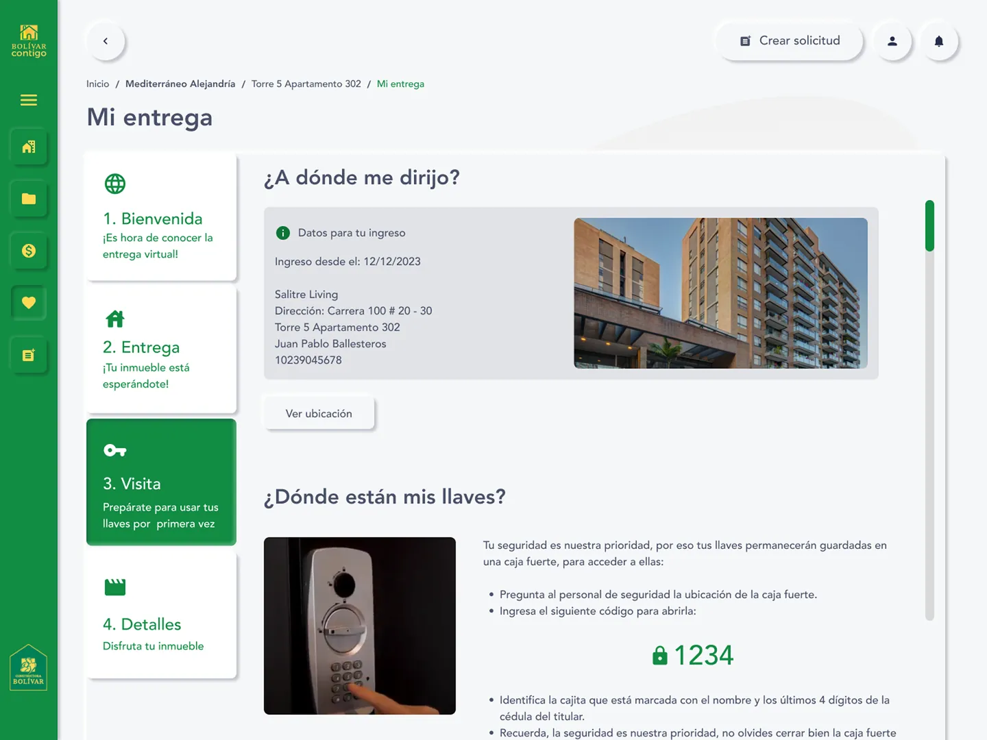
The delivery became a short sequence of four steps, from a welcome message to the details of the home. Each step answers one question. When is my appointment? Where do I go? Where are my keys? How do I check my home?
The keys wait in an on-site lockbox; the platform shows the code and how to find the right box. After the walk-through, a review guide and a countdown make the 15-day warranty window hard to miss.
04 Reporting what’s wrong
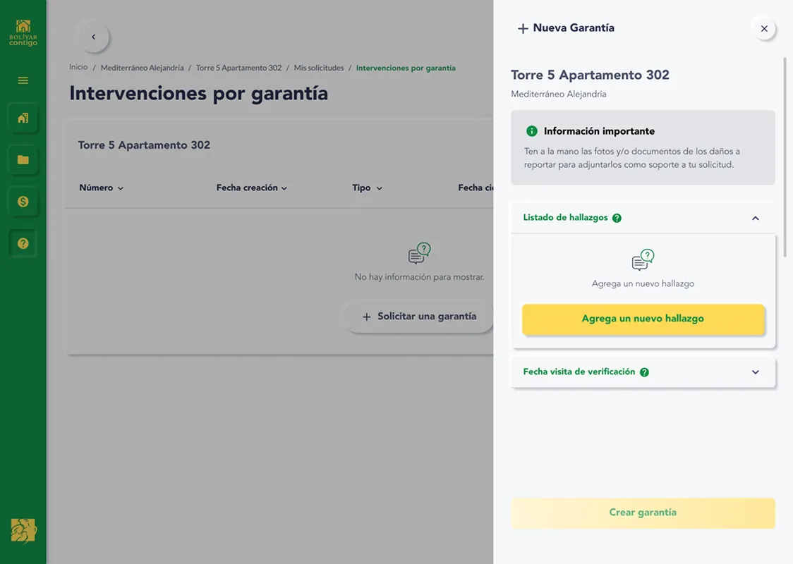
Small issues show up once people move in. Instead of phone calls, owners open a warranty request from a side panel: they list each finding with photos or documents and pick a date for a verification visit.
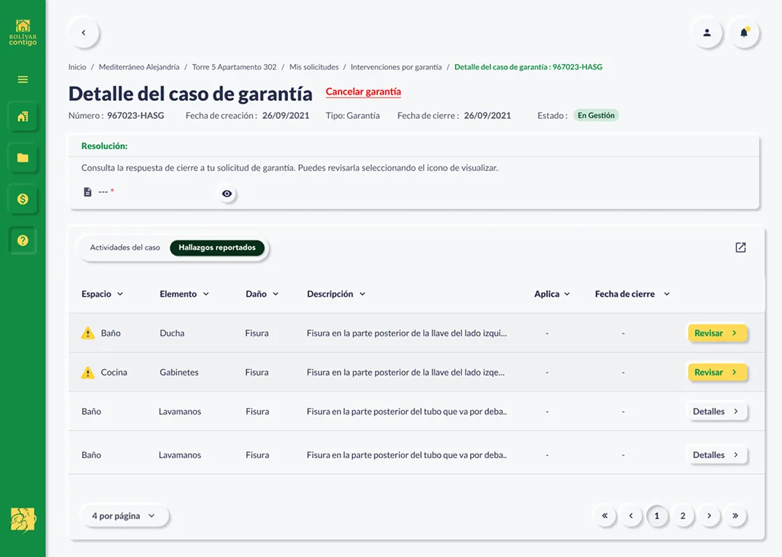
Each case then has its own page, with its status, the resolution, and every finding by room and element. Warning icons point to the findings that need the owner’s review.
05 After the handover
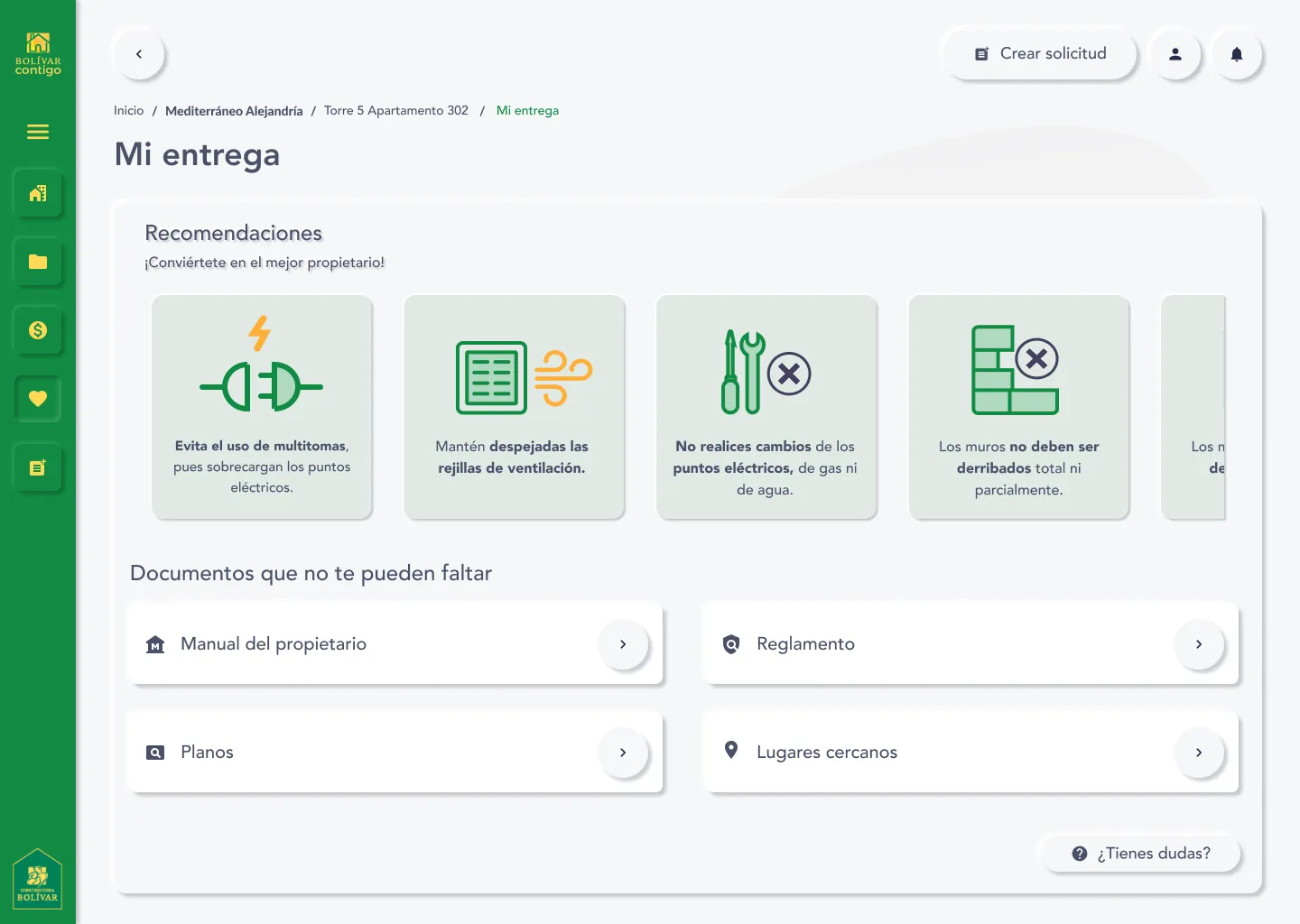
Living in the home brings new questions. The platform keeps simple care recommendations up front and the documents people need at hand: owner’s manual, building rules, floor plans and nearby places.
06 Components
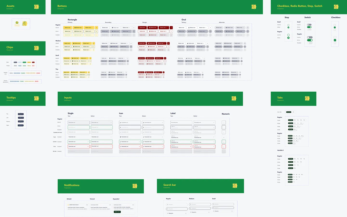
Constructora Bolívar already had a design system. I extended it with the pieces this platform needed (buttons in four sizes, inputs with their validation states, chips for case status, tabs, tooltips, notifications and search) and documented them for development.
I also proposed accessibility improvements: stronger color contrast, clearer focus states and more space in forms. They weren’t implemented at the time, but they started a useful conversation about inclusive design.
07 Outcome
After the handoff, the client began implementing the designs.
It taught me to design for emotional clarity, not just usability: giving people a sense of control on a day when a lot is happening at once.
Designed at Perficient for Constructora Bolívar with Kevin Rubio and Lina Marcela Cadavid. Screens use sample data; no real customer information is shown. Constructora Bolívar and Bolívar Contigo are trademarks of their owner.