Case study · via Perficient, with Interbrand

Honeywell

A new website for Honeywell, designed while its brand was being redesigned: interfaces that had to keep up with a brand still taking shape.
My role
  • UI/UX DesignerPerficient
  • Homepage conceptsOption B, comps for the round
  • Components and templatesStories, insights, products, forms
  • Figma prototypesNear-functional, for client reviews
  • Image curationWith David Beltrán
Team
  • Sebastián CastilloMeUI/UX Designer · components, templates, prototypes
  • Tyson DammanDirector · selected homepage concept
  • Anabel RuizLead Designer · library, documentation, variables
  • David BeltránSr. Designer · support pages, image selection
Timeline
  • Oct 2025 – Mar 2026Alongside Honeywell Aerospace
  • Brand by InterbrandRedesigned in parallel
Project
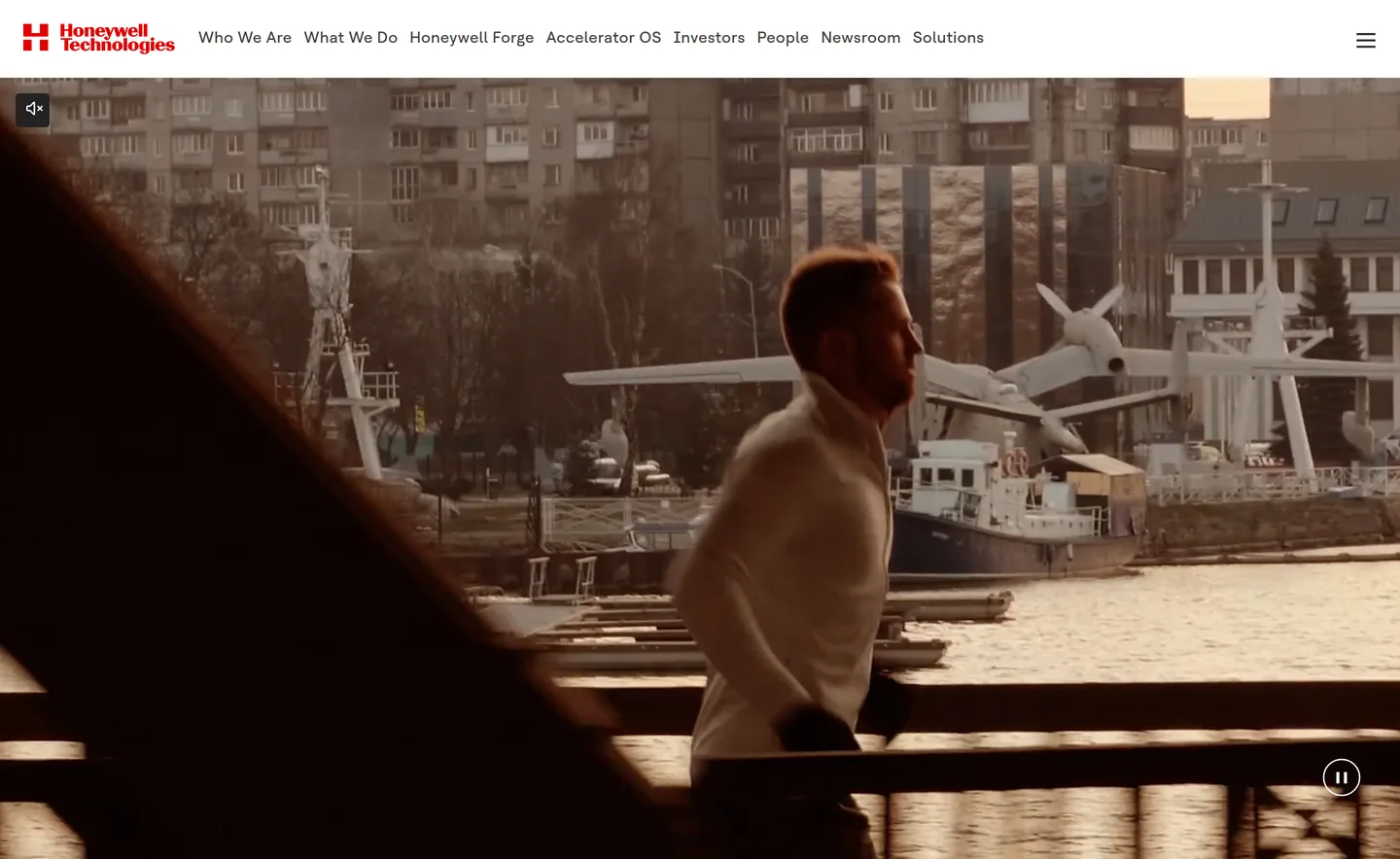
Honeywell homepage hero: an aerial photo of a city skyline at golden hour under the new Honeywell Technologies navigation
The live homepage at honeywell.com.

01 A brand in motion

Interbrand was redesigning the Honeywell brand at the same time as we designed the website, so the interface had to absorb changes continuously: type, color, imagery and tone kept evolving while the screens were being built.

We started from a very simple style tile and moved straight into screens, so the brand could be seen working on real pages, not just on a board.

02 Concepts, not just tiles

Instead of more style tiles, we built proofs of concept: full homepages, far enough along to judge how the new brand behaved with real content.

I designed Option B: the new logo large at the top, on warm light backgrounds. The client chose Option A, by Director Tyson Damman. I worked on many of the comps around it, and from there moved on to the components and templates for the rest of the site.
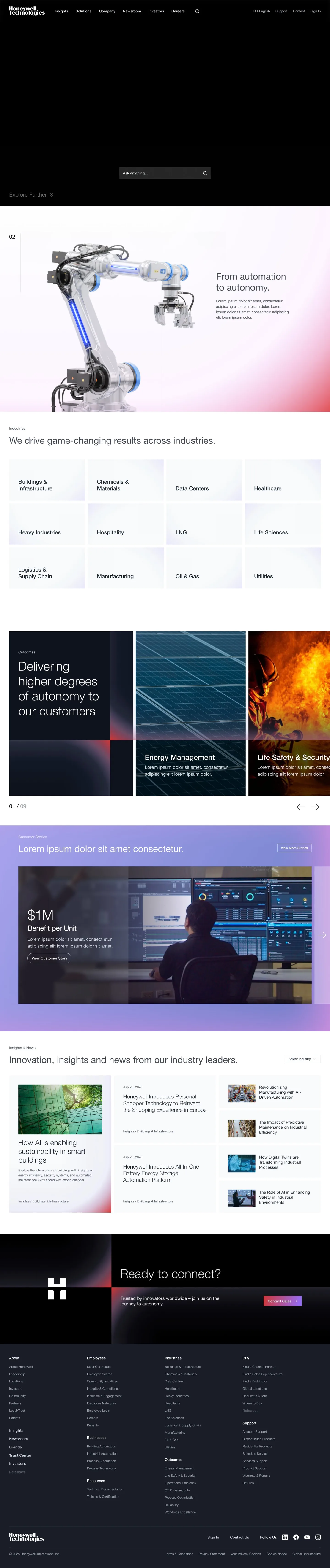

Homepage concept A: a dark hero with search, a numbered “From automation to autonomy” section with a robotic arm, an industries grid, outcome cards, a customer story, insights and a closing call to action
Option A · by Tyson Damman · selected. Its hero had a small animation, built in Figma.
Homepage concept on light backgrounds: the large Honeywell Technologies logo with search, an AI platform section, results by industry, outcomes, a customer story and insights
Option B · my concept.

03 Components and templates

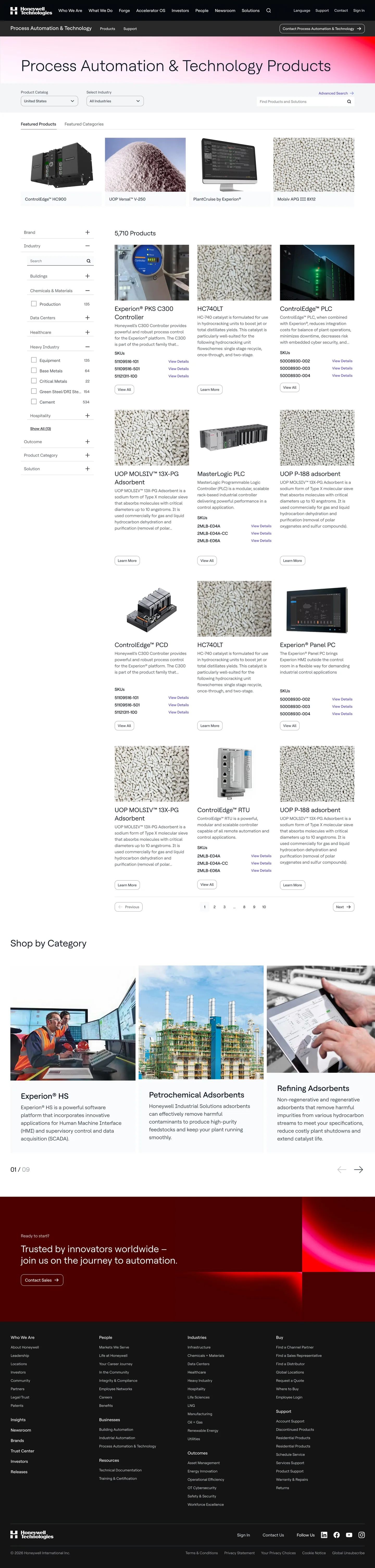
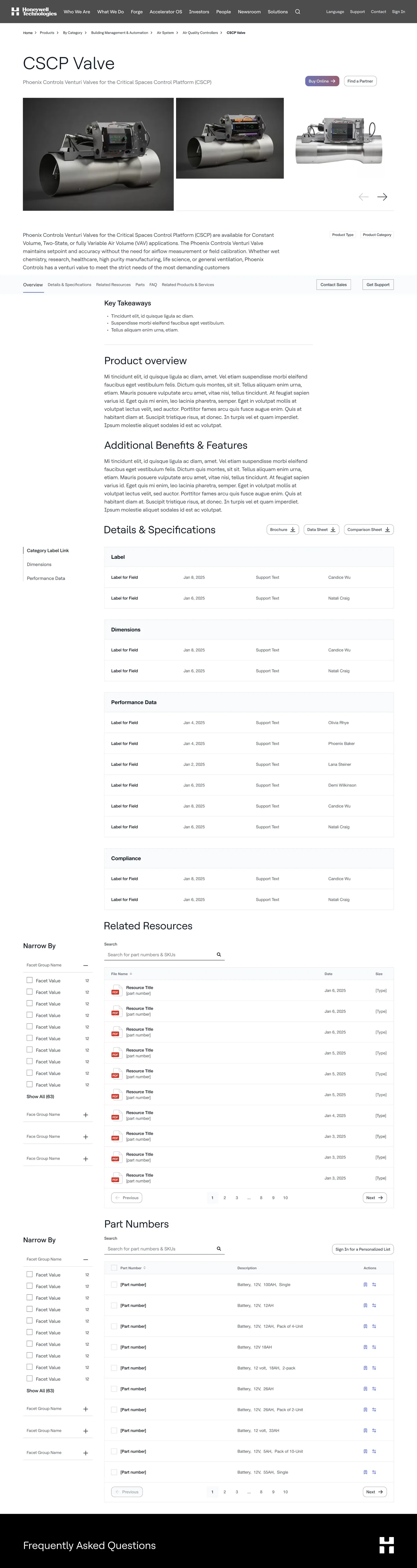
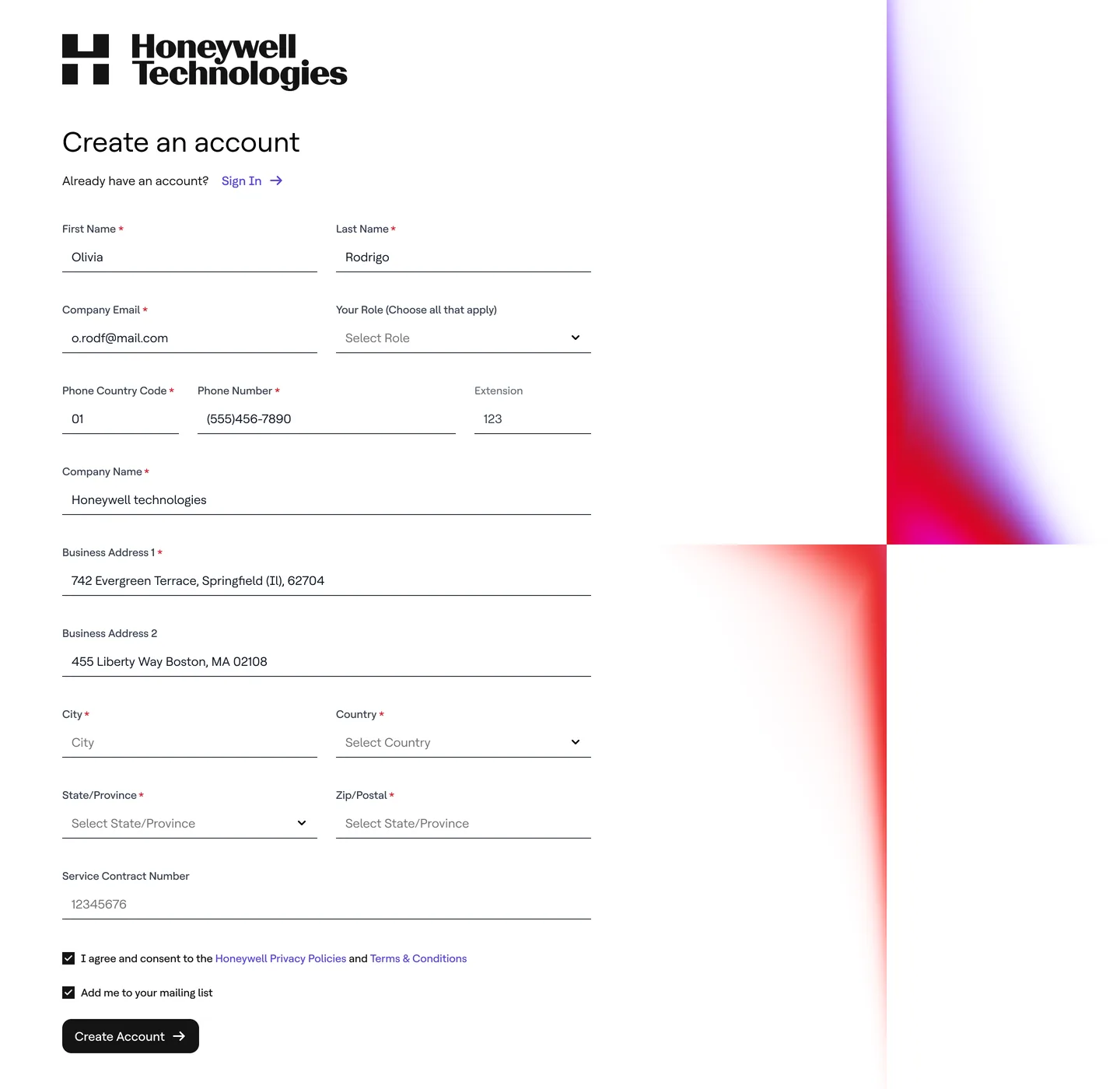
With the direction set, I designed the components for most of the other pages: customer stories (everything below the hero), insights and news, FAQs, the registration form, gated assets, and the product pages, from the listing with its filters to the product detail.

Lead Designer Anabel Ruiz joined to help with more screens and to own the design library, its documentation and variables; later, David Beltrán joined for the support pages.

Customer story template: results in large numbers, a quote carousel, anchor navigation with key takeaways and long-form text, solutions in this story, a leadership statement and related stories
Customer story template (everything below the hero). Scroll inside the frame.
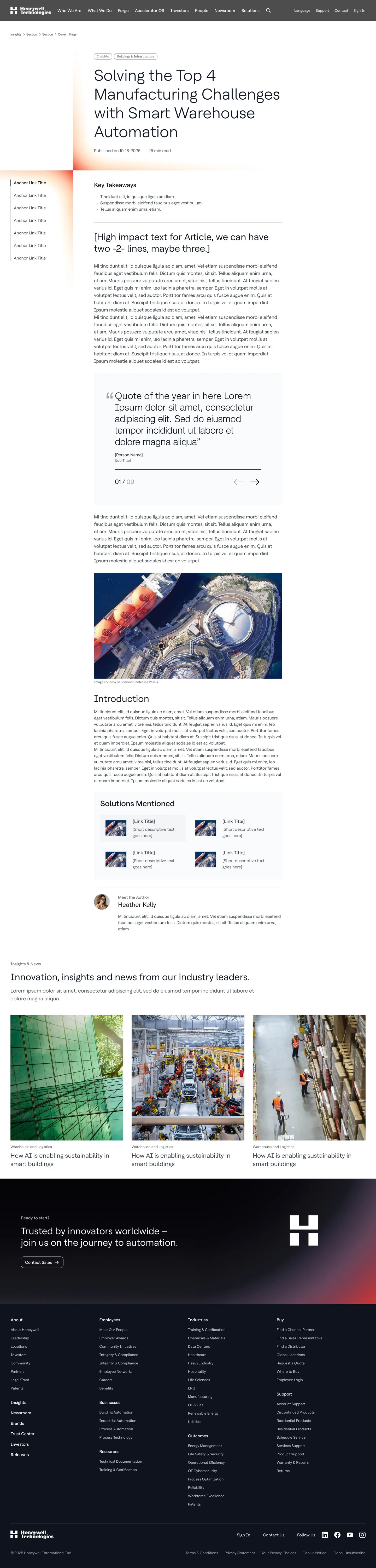
Article template: title and tags, anchor links, key takeaways, a highlighted statement, body text, a quote carousel, an image, solutions mentioned, the author and related insights
Article template, with key takeaways, a quote carousel and the solutions mentioned. Scroll inside the frame.
Product listing page for process automation products: catalog and industry selectors, featured products, a filter sidebar, product cards with SKUs and links, pagination and shop by category
Product listing page: featured products, filters and product cards with their SKUs. Scroll inside the frame.
Product detail page for a valve: gallery, overview, sticky section tabs, details and specifications tables, related resources with filters, and a part numbers table
Product detail page: specifications, related resources and part numbers, each with its own filters. Scroll inside the frame.
Building Automation landing page: products, brands, key features, solutions carousel, customer stories, insights, important links, a frequently asked questions accordion, locations and contact cards
A business landing page assembled from the components, including the FAQ. Scroll inside the frame.
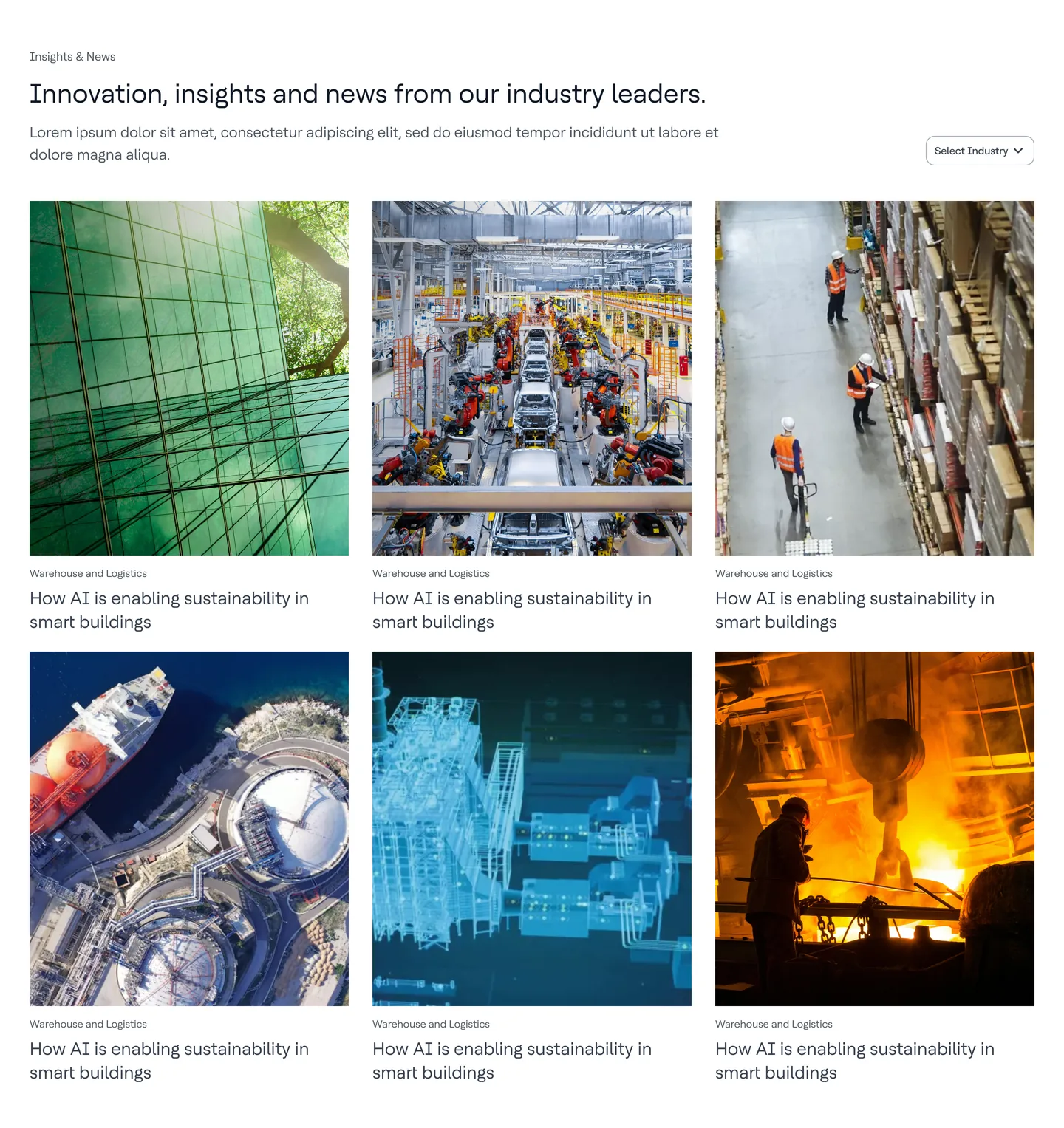
Insights and news section: a heading, an industry filter and six article cards with photography, category and title
Insights and news, with an industry filter.
Create an account form with underlined fields for name, company email, role, phone, company and address, consent checkboxes and a Create Account button, next to the brand’s red and violet gradient
Registration form.

04 Prototypes for every review

For client meetings I built many near-functional prototypes in Figma, so decisions were made on something that behaved like the site, not on static screens.

05 A month of images

Once the templates were ready, David and I were assigned to find the imagery to populate the site: a search that took about a month, given how many pages and industries it had to cover.

The redesigned site is now live.

06 What I took away

Honeywell and Honeywell Aerospace are the projects I have enjoyed most so far, largely because they sit so close to branding. On Honeywell I got to see first-hand how work at this level is done: the presentations, the mockups, the proofs of concept. Watching all of it up close was genuinely exciting.

Designed at Perficient for Honeywell with Tyson Damman (Director), Anabel Ruiz (Lead Designer) and David Beltrán (Sr. Designer); brand by Interbrand. Screens come from the design files and use placeholder text and images. Honeywell is a trademark of its owner.

More work

All projects
  1. Previous projectMissionSquareFull website redesign. My visual direction was chosen out of five.
  2. Next projectHoneywell AerospaceWebsite redesign: polished templates, concepts and art direction.