Case study

Barco Products

A new website for a maker of outdoor site furnishings, built on the visual direction I proposed.
My role
  • UI Designer
  • Visual directionSelected out of two
  • Templates and main navigationDesktop and mobile
Team
  • Sebastián CastilloMeUI Designer
  • Lina CadavidProduct page
  • David BeltránSecond direction
  • Joe AndrettaDirector
Timeline
  • March–June 2026~4 months
  • Launched October 2026Canada first, then the US
Project
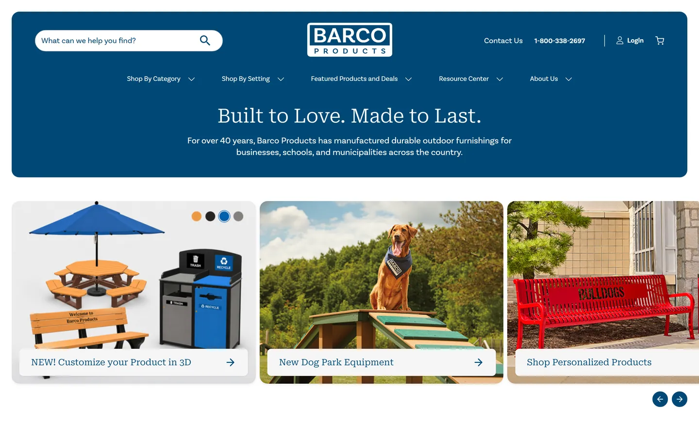
Barco Products homepage on desktop: a rounded blue header with search, logo and menu, the headline Built to Love. Made to Last., and three photo cards for customizing a product in 3D, dog park equipment and personalized products
The new homepage, live on barcoproducts.com.

01 The brief

Barco Products makes outdoor furnishings for businesses, schools and municipalities: benches, picnic tables, trash receptacles and more. The project was a redesign of both of its websites, barcoproducts.com for the US and barcoproducts.ca for Canada. Both launched in October 2026, Canada first.

02 Two directions, one chosen

Joe Andretta, our director, set the overall course; the rest of us did the design work. We started with an exploration session and then presented two visual proposals: one by David Beltrán and one by me. The client chose mine, and the rest of the project was built on it.

David moved to another project soon after the start. Lina Cadavid joined, designed the product page and we reviewed several versions of it together. I designed the homepage, the product listing, About Us, Contact Us, the article page and the main navigation, and their responsive versions.

03 A hero made of cards

Barco has several sub-brands, events and special promotions, all asking for the top of the homepage. Instead of a single banner, the hero is a row of cards, so there’s room for all of them.
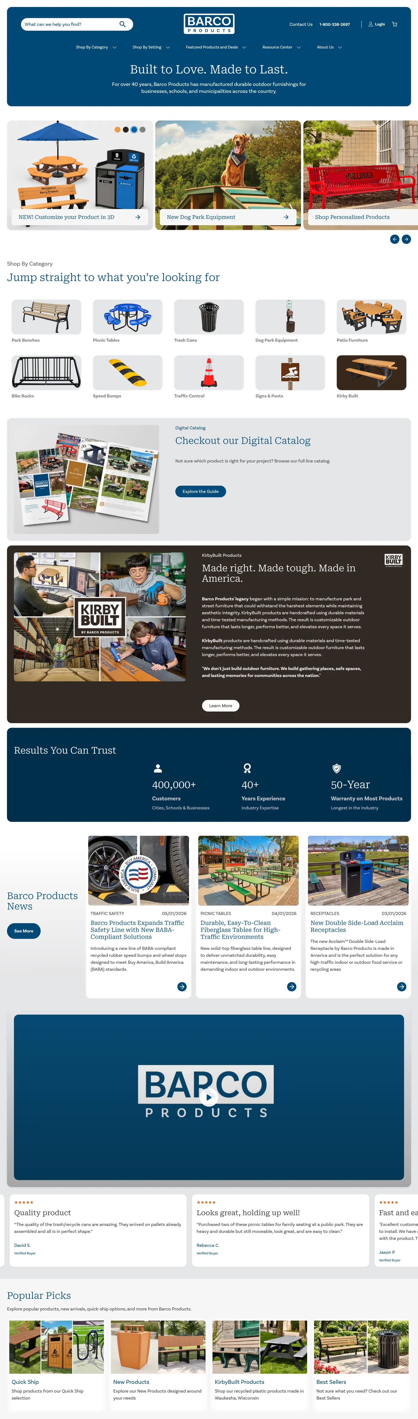
The full homepage: hero cards, shop by category icons, the digital catalog, a KirbyBuilt section in dark brown, key numbers, news, a video, customer reviews, popular picks and the footer
The full homepage. Scroll inside the frame.

04 Brown means KirbyBuilt

KirbyBuilt is a brand Barco had recently acquired, and customers still asked for it by name. It needed to be easy to spot, so everything that belongs to KirbyBuilt is marked in brown, set apart from Barco’s blue.
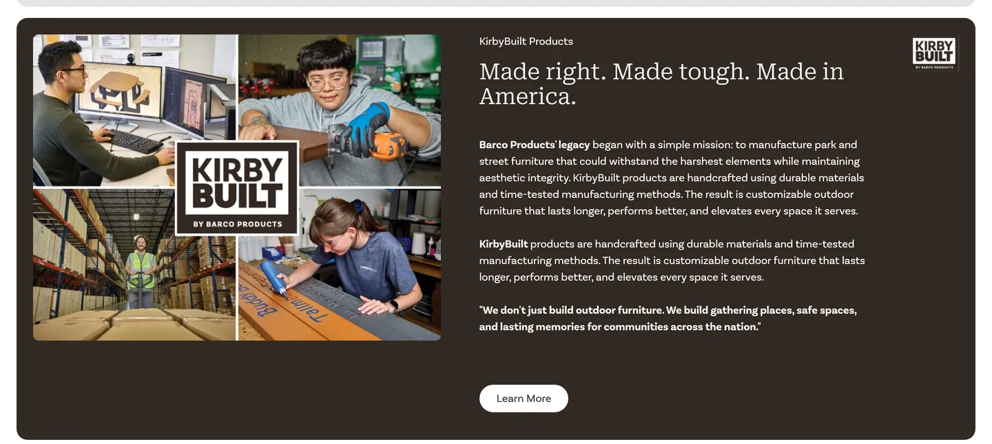
KirbyBuilt section on a dark brown background: a photo collage with the KirbyBuilt logo, the headline Made right. Made tough. Made in America., three paragraphs and a learn more button
The KirbyBuilt section on the homepage.

05 The main navigation

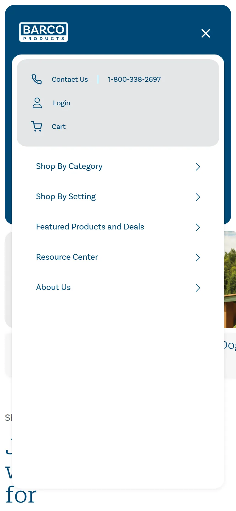
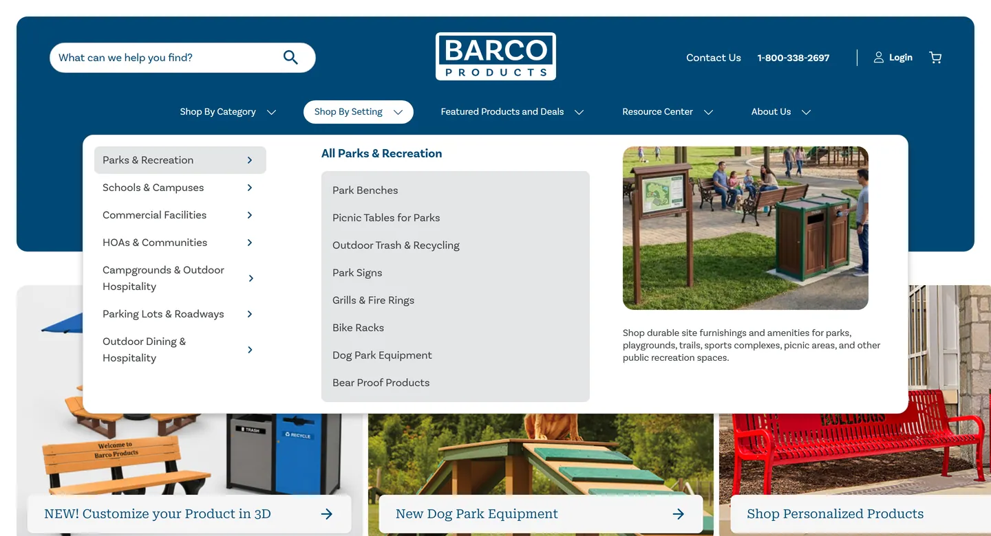
I designed the main navigation. On desktop, each section opens a panel with its categories, their subcategories and a photo. On mobile, it becomes a full-screen menu with contact, login and cart on top.
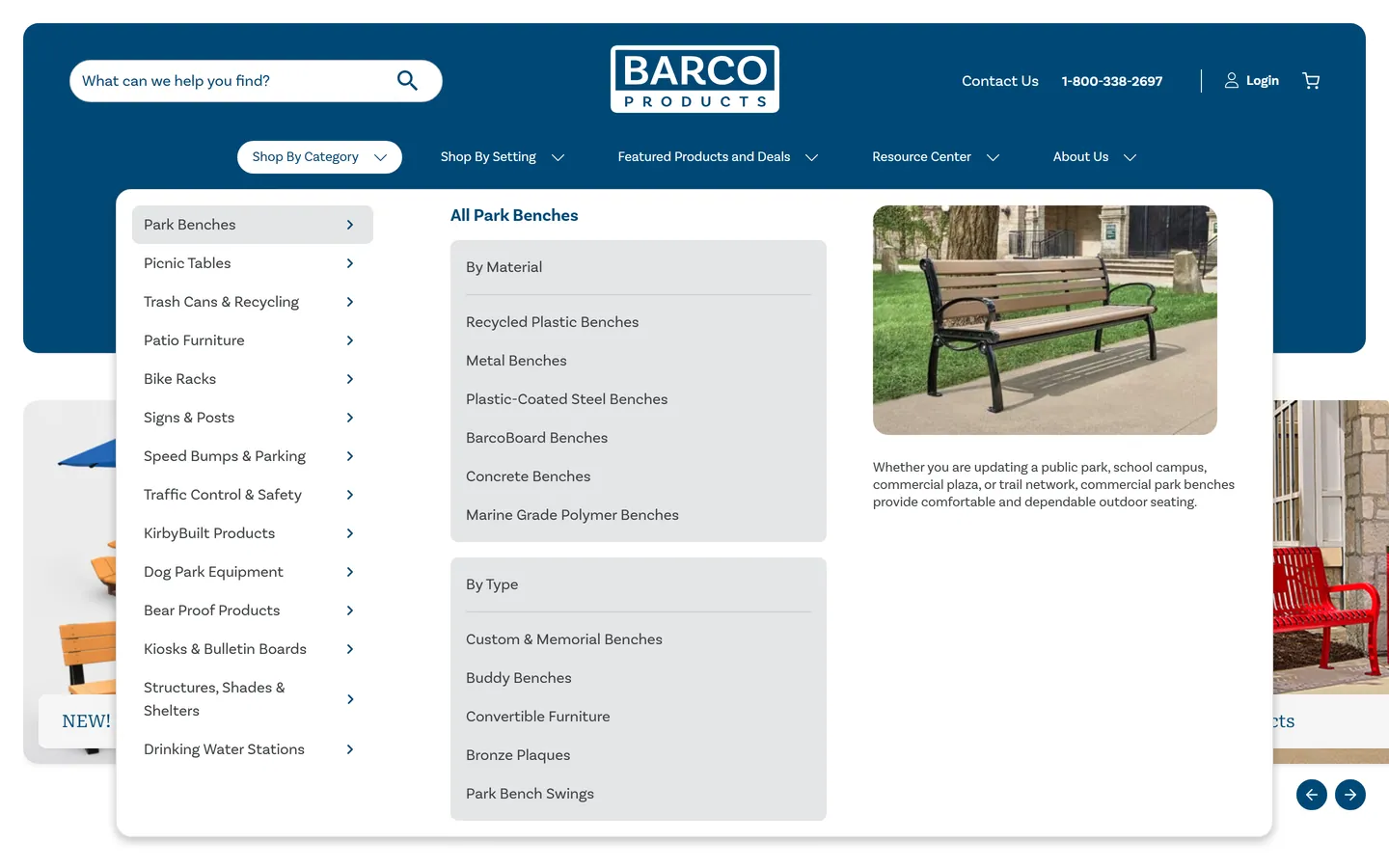
Shop By Category menu open: a list of categories on the left with Park Benches selected, its subcategories grouped by material and by type, and a bench photo
Shop By Category.
Shop By Setting menu open: settings such as parks and recreation, schools and campuses and commercial facilities, with the products for parks and a photo of a park
Shop By Setting.

06 The templates

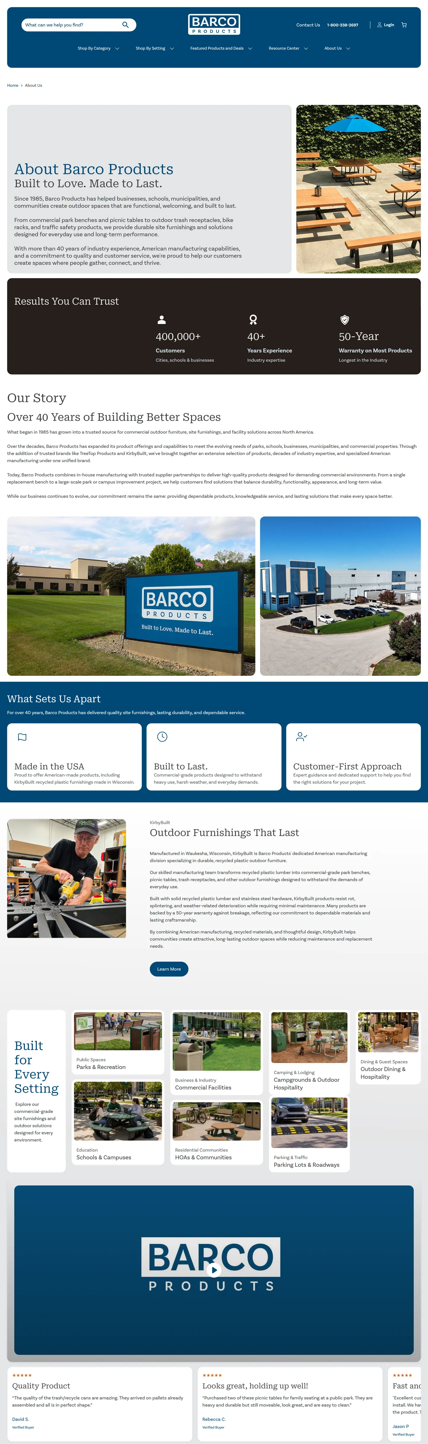
Beyond the homepage, I designed the product listing and the content pages: About Us, Contact Us and articles.
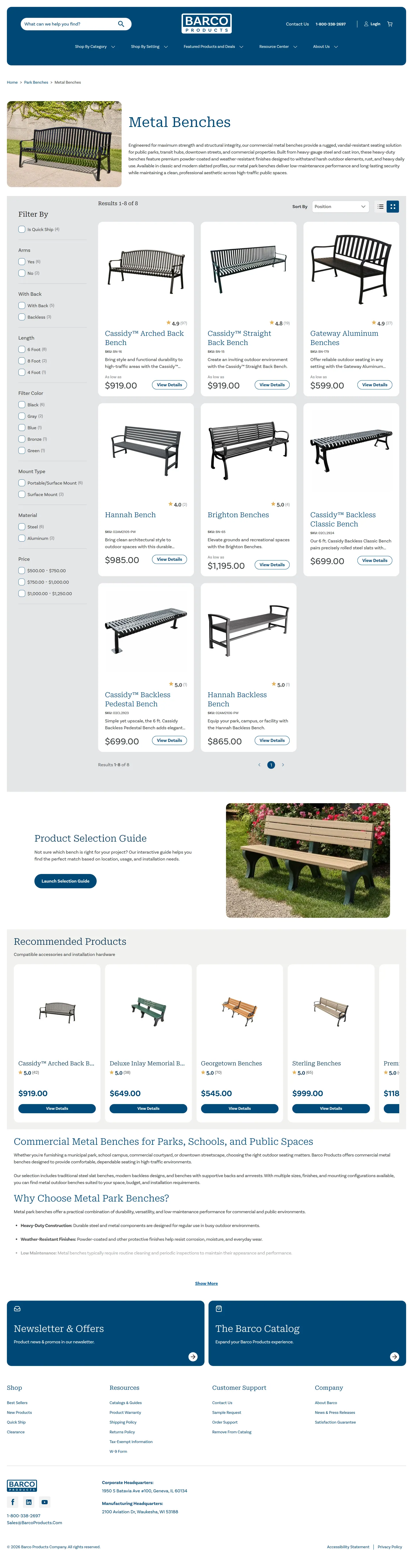
Metal Benches product listing on desktop: a category header with a photo and description, filters in the left column, a grid of benches with prices, a product selection guide and recommended products
Product listing. Scroll inside the frame.
About Barco Products page on desktop: an intro with a photo, key numbers, the company story with photos of the headquarters, what sets Barco apart, a KirbyBuilt section in brown and shopping by setting
About Us. Scroll inside the frame.
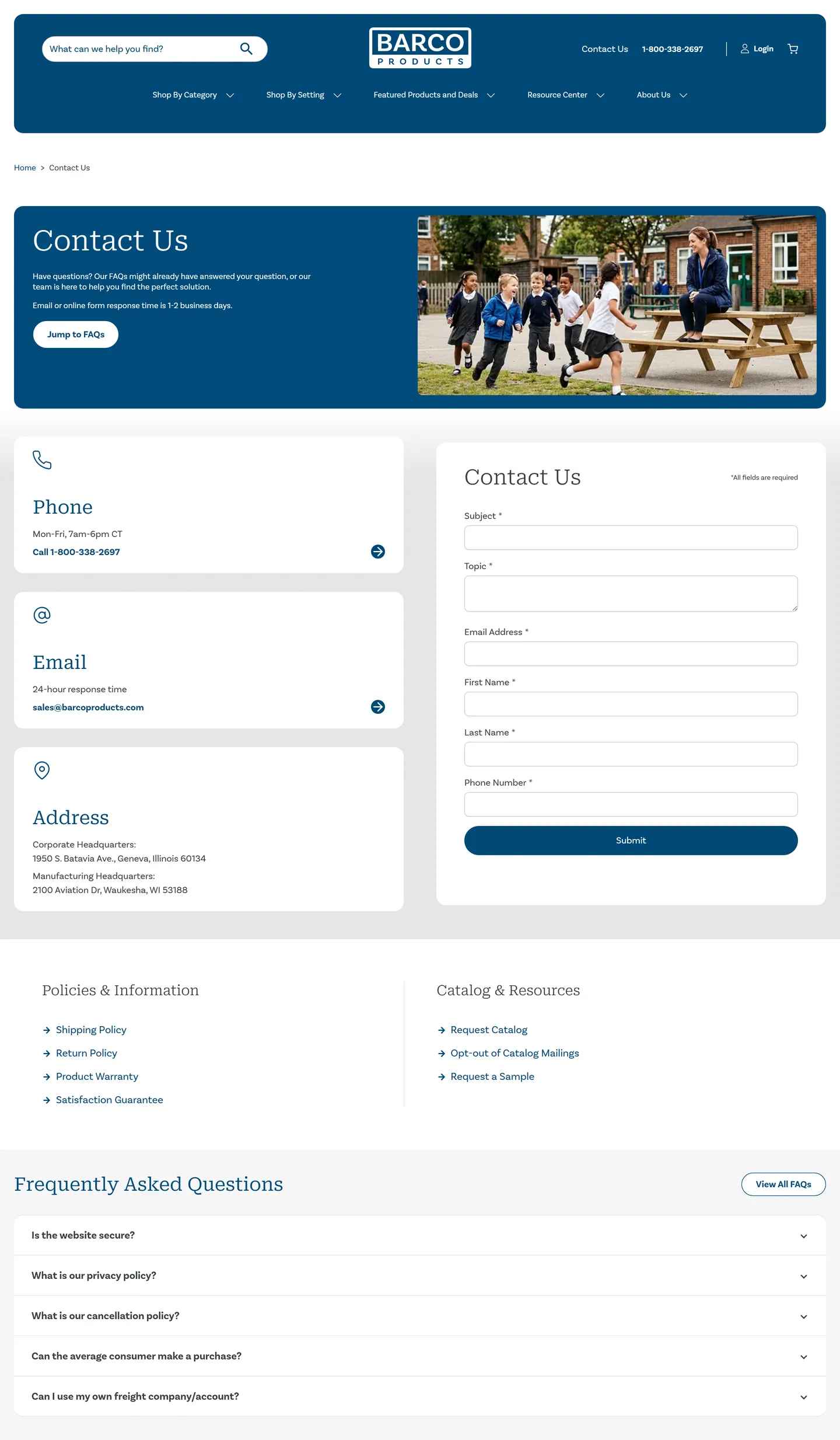
Contact Us page on desktop: phone, email and address cards next to the contact form, policy links and frequently asked questions
Contact Us. Scroll inside the frame.
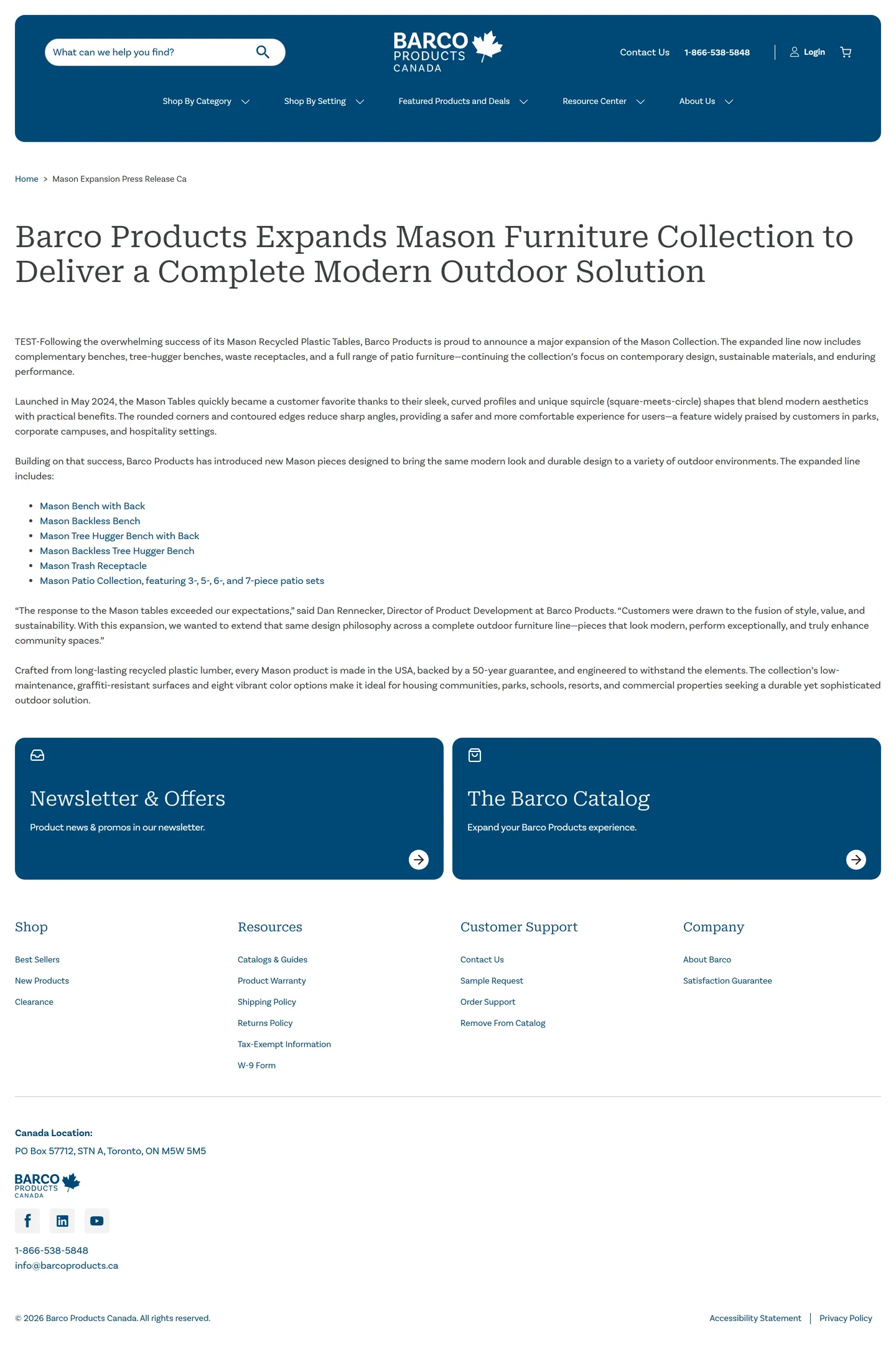
Press release article on desktop about the Mason furniture collection: headline, body text, a product list and a quote
Article, on the Canadian site. Scroll inside the frame.

07 Mobile

I also designed almost all of the mobile versions.
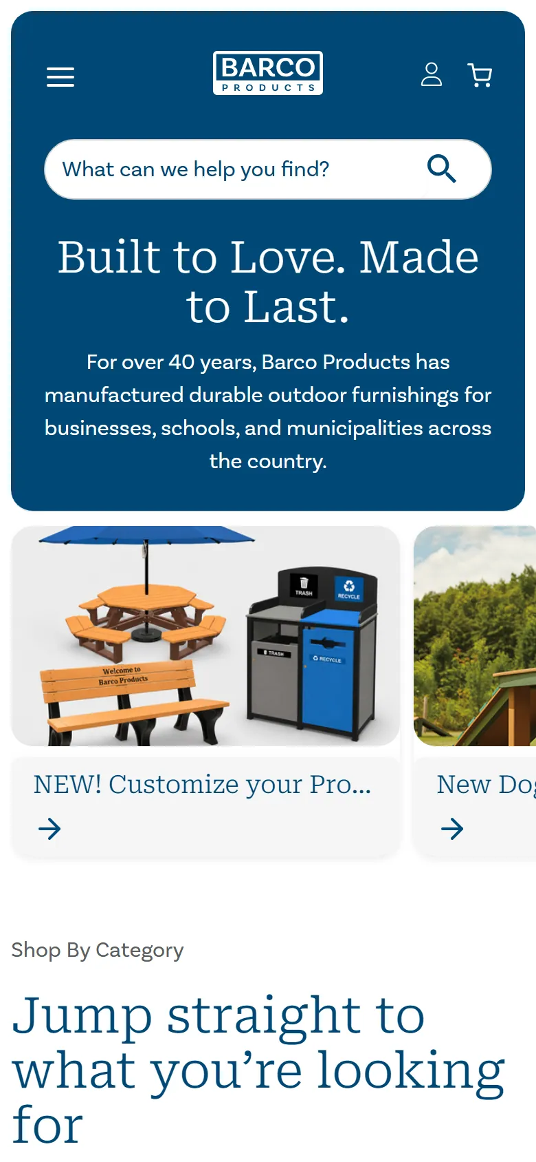
Homepage on mobile: the blue header with search, the headline and the first hero card, a customizable picnic table
Homepage.
Main navigation open on mobile: contact, login and cart on top, then the five menu sections
Main navigation.
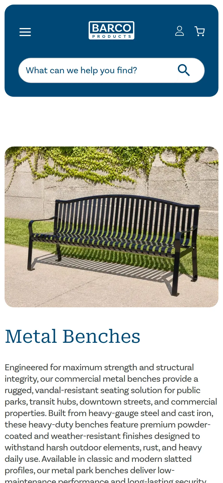
Metal Benches product listing on mobile: category photo, title and description
Product listing.
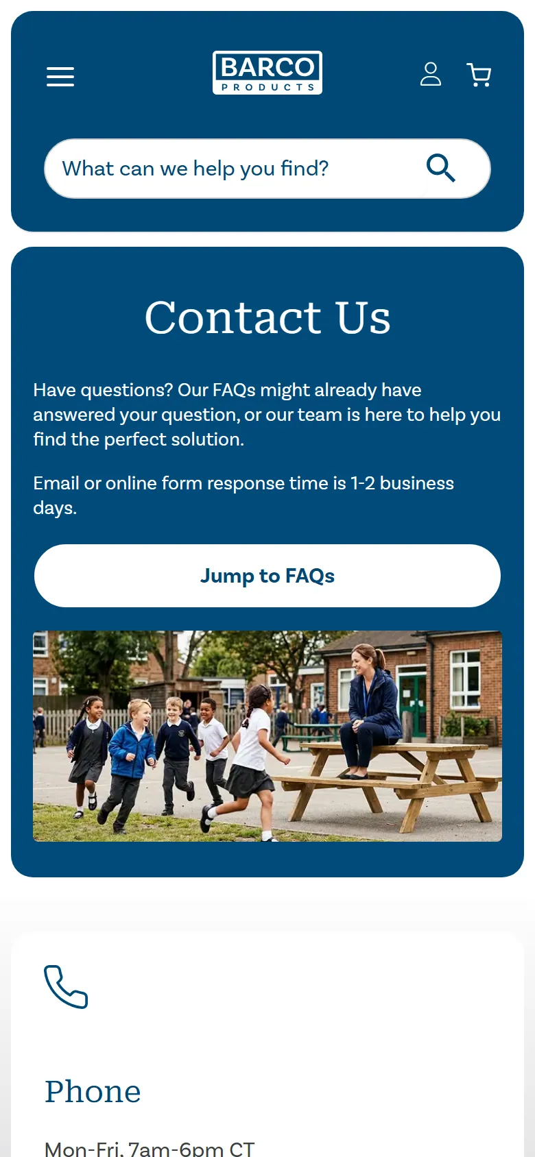
Contact Us on mobile: a blue header with a jump-to-FAQs button, a photo and the first contact card
Contact Us.

08 Before and after

The same page on barcoproducts.com, captured a few days before and after the new design went live.
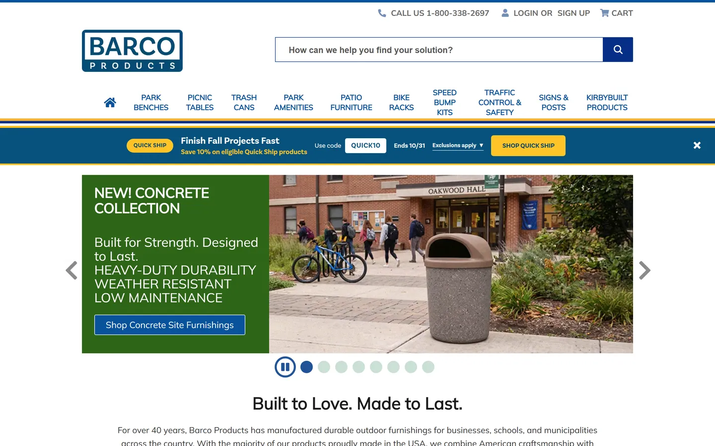
The previous design on barcoproducts.com: a white header with a boxed logo, a two-line icon menu, a yellow and blue promo bar and a slider with a concrete trash receptacle
Before: the previous design.
The new design on barcoproducts.com: rounded blue header, headline and hero cards
After: the new design.

09 Polishing and support

After Lina moved to another project, I stayed on to finish: polishing the designs, applying styles and answering developers’ questions, technical and design ones alike.

Designed at Perficient for Barco Products with Lina Cadavid, David Beltrán and Joe Andretta (Director). Screens captured from barcoproducts.com in October 2026, before and after the launch; the article page from barcoproducts.ca. Barco Products and KirbyBuilt are trademarks of their owners.

More work

All projects
  1. Previous projectPerficientInternal project management tool and dashboards.
  2. Next projectMissionSquareFull website redesign. My visual direction was chosen out of five.